BRAND CORPORATE IDENTITY & PUBLISHING DESIGN - FINAL TASK
BRAND CORPORATE IDENTITY & PUBLISHING DESIGN - FINAL TASK

03/06/21 - 30/06/21 (Week 10 - Week 14)
INSTRUCTIONS
FINAL PROJECT
FEEDBACK
Week 11 (09/06/21) - Mr Vinod
REFLECTION
Experience:
FURTHER READING

03/06/21 - 30/06/21 (Week 10 - Week 14)
Chan Jing Wen (0340480)
Brand Corporate Identity & Publishing Design
Final Task
Brand Corporate Identity & Publishing Design
Final Task
INSTRUCTIONS
FINAL PROJECT
Week 10 (01/06/21)
Ms Hsin briefed us on the task and she wanted us to include the below information in our brand guide:
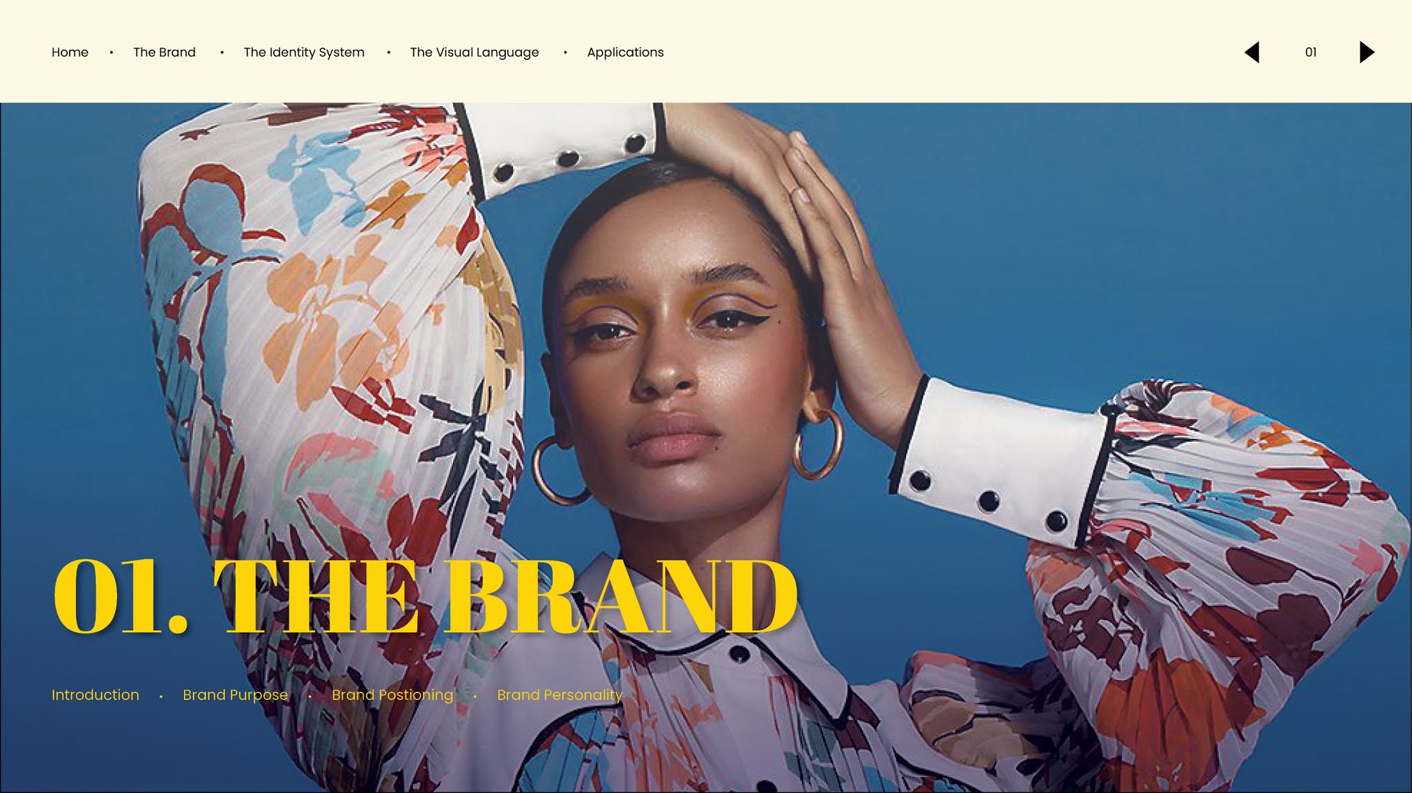
1.0 Brand
1.1 Introduction
1.2 Brand Purpose
1.3 Positioning
1.4 Brand Personality
2.0 The Identity System
2.1 The Logo
2.1.1 Logotype
2.1.2 Symbol
2.1.3 Logo Lock-up
2.1.4 Logo Exclusion Zone
2.1.5 Improper Usage
2.2 Typography
2.3 Colour
3.0 The Visual Language
3.1 Photography & Illustration
3.2 Graphic Elements & Composition
4.0 Applcations
4.1 Stationery
4.2 Communication
4.3 Environment
4.4 Merchandise
I started with the first chapter write up. I referred to the Darrma interview Ms Hsin had with their CEO, Natasha. After that, I worked on some parts of the navigation.
 |
| Figure 1.1 Navigation Process |
I only did the navigation up till "The Brand" since we had to show our progress of the spreads up to that chapter for both modules.
Below was my first attempt:
Figure 1.2 Brand Guideline 1st Attempt
Week 11 (07/06/21)
We didn't have class on 7th June so I didn't manage to receive feedback from Ms Hsin on the brand guide. I managed to receive feedback from Mr Vinod on 9th June. I tried to find better pictures that I felt represented the brand better.
 |
| Figure 1.3 Folder of potential photos |
After the feedback, I made the amendments to show Ms Hsin:
Figure 1.4 Brand Guideline 2nd Attempt
After receiving feedback from Ms Hsin during the weekends, I continued to work on the feedback to finish up till the 2nd chapter. Below is the attempt:
Figure 1.5 Brand Guideline 3rd Attempt
Week 12 (14/06/21)
After feedback, I added all of the information into the brand guide. I tried to add more variations to the layout (especially in the spreads for chapter 3 and 4).
 |
| Figure 1.6 Slide 01 for Photography |
 |
| Figure 1.7 Slide 02 for Graphical Elements |
 |
| Figure 1.8 Slide 03 for Communication |
Below is the attempt:
Figure 1.9 Brand Guideline 4th Attempt
Week 13 (21/06/21)
After Ms Hsin's round of feedback, I made minor amendments to the spreads. I also noticed that some of my images were incorrect (I use previous attempt photos instead of the final one) so I also changed those from the spread. Below is the attempt for the brand guide:
Figure 2.1 Brand Guideline 5th Attempt
After showing Mr Vinod the above brand guide, I further made amendments on my Brand Guidelines. I first amended on the layout problems, such as the shadow underneath the title text, the leading of texts, and the slashed between each of the navigation.
 |
| Figure 2.2 Navigation and shadow (Before) |
 |
| Figure 2.3 Navigation and shadow (After) |
I tried to change my previous and next buttons to use elements of my logo. I didn't like it because of the points sticking out. However, it wouldn't make sense if I deleted the points and left the circle. It looked weird so I stick with my original one.
 |
| Figure 2.4 Attempt of switching navigation to logo element |
Below is my 6th attempt for the layout:
Figure 2.5 Brand Guideline 6th Attempt
After finalizing the the layout, I wanted to try making it more interactive. Since animations wouldn't work in an interactive pdf, I wanted to add a drop down menu in the navigation bar so people can go to each section easily. However, I tried a few times and I don't know why it couldn't work.
 |
| Figure 2.6 Preview of the failed attempt |
In the end, I decided to attempt it in another way. I placed the navigation of each section under each of their title page. Below are the navigations I placed:
 |
| Figure 2.7 Section 1 |
 |
| Figure 2.8 Section 2 |
 |
| Figure 2.9 Section 3 |
 |
| Figure 3.1 Section 4 |
Below is my 7th attempt:
Figure 3.2 Brand Guideline Attempt 7
Week 14 (28/06/21)
After receiving feedback from Mr Vinod, I made more amendments to the brand guide to increase some interactivity.
My first idea was for the backgrounds of the spreads for colour to change colour when the user presses the colours at the side. I test it and it worked fine in InDesign but it somehow couldn't work after being exported.
 |
| Figure 3.3 Failed Attempt |
Since I couldn't figure out the problem, I decided to move on from that and think of other effects I could add. Also, I didn't wanted the effects to be somewhat useless and added just for the sake of it, so I looked into what else I could do.
I decided to make amendments for my website spreads. Since my website was divided into 3 pages, I figured it would be a bit too much for users, especially if they wanted to go back and forth between the different sections. So, I created pop up windows for each section of the website so the users can directly view all the information in one spread. I tried it in a separate file since I was worried my other effects would be affected.
 |
| Figure 3.4 Attempt to add interactivity for the website spread |
After that, I also decided to have something like a carousel, but different since it can't be done in InDesign, for the ones that have a lot of images. Below is an example of the application of the effect:
 |
| Figure 3.5 Attempt to add "carousel" for spreads with more pictures |
After adding these effects, I felt like I didn't really manage to spread the effects evenly across various sections. The effects were mostly introduced in the last section. In the end, I added a hover effect for the text in the improper usage system since I kind of felt like the amount of text made it look a bit messy. However, other than that, there weren't much other effects added to the brand guide either.
 |
| Figure 3.6 Hover effect for the text in Improper Usage |
Below is my FINAL SUBMISSION:
Figure 3.7 Final Submission for Brand Guideline (PDF)
FEEDBACK
Week 11 (09/06/21) - Mr Vinod
General Feedback:
We need to think about the user experience. If the next page and previous page buttons are so far apart, it will decrease the user experience. The logo should stand out at the first page since it's more important than the word "brand guidelines".
Specific Feedback:
Try to find photos that represent the brand better. Show more Asian representation too since it's an Asian brand. It's fine to have a different placement style of the photos if it's meant to be vertical. The subtext and main text should not have similar text style as it will confuse others. Be consistent with the visual used in the brand guide. If it's one slash then use one, two then two for all. The numbering in brand personality is unnecessary and it's too far from the points.
Week 11 (12/06/21) - Ms Hsin
General Feedback:
Do not just copy and paste what is in the interview. Rephrase it so it sounds like it's from a brand standpoint instead of a person.
Specific Feedback:
The photos are not that suitable, try finding better photos. The layout is fine but they look kind of plain. Try adding a background colour to the spreads. The points for brand personality should sound like it's describe a person, not as a brand. First 2 points aren't that suitable so try to rethink on what words can be used. The subheading can try to use the other font instead of the current one.
Week 12 (16/06/21) - Mr Vinod
Specific Feedback through Messenger:
The layout looks fine. My classmates misunderstood logo lock up and how to create clear space so watch the recording and listen to the comments. Try to break the layout with some variation.
Week 13 (21/06/21) - Ms Hsin
General Feedback:
Make sure to be less wordy when presenting the information.
Specific Feedback:
Change the photos for brand personality, remove the shadow from applications, update the cover post for twitter, change the 2 side photos under best selling pieces in the website, and remove the left photo that is cropped for the premium box packaging. Other than that, overall structure and content of the brand guideline looks fine.
Week 13 (23/06/21) - Mr Vinod
General Feedback:
There is not much interactivity in our brand guidelines. We must be able to think from a users perspective.
Specific Feedback:
The layout is fine, but the interactivity is low. The slashes between the navigation are too distractive. Shadows behind the title text are too strong. The name of the cardholder on the business card shouldn't be this big. What if the person has a longer name? The photos I chose for the Instagram should be more relevant to the brand. Right now they're more plain, not much patterns on the clothing. Logo lockup not clear enough, usually people will look at the image first before looking at the text so the image must be clear enough to stand alone without the text. My patterns are too strong. For those collaterals like letterhead design, can see that the pattern is very saturated. If it was really printed out, the colour would appear even at the back of the paper.
Week 14 (30/06/21) - Mr Vinod
General Feedback:
There is still no interactivity in our brand guides. Some of us don't even have our navigations done properly. We must be able to think of how the users will engage with the brand guide.
Specific Feedback:
The navigations in content page are not working.
REFLECTION
Experience:
Week 10 (01/06/21); This week was a bit more chill for this project since I was mostly done with the previous projects from both modules. The main thing that I really struggled with was the photos I could use. Week 11 (08/06/21); Continuing last week, I was quite confused with the photo selection for the brand guide. Other than that was still manageable. Week 12 (16/06/21); I completed the whole brand guide layout during this week. I think I didn't have that much of a hard time finishing it compared to when I started it. I guess it might be because I had all of the photos ready so I only had to focus on the layout. Week 13 (24/06/21); I was kinda bumped that a lot of the animation couldn't be use in an interactive pdf, so I was kinda worried that it's not gonna be that interactive as I would want it to be.
Observation:
Week 10 (01/06/21); I notice that a lot of our seniors' blog were quite simple for this project. Maybe it's cause it's the last project so they kept it simple. Week 11 (08/06/21); I notice that I didn't really rfer to my seniors' blog that much compared to the other projects. Week 12 (16/06/21); I notice that I'm not that innovative in making the layout look more different because I'm quite reserve with what I do. I'm afraid that things will look too out of place if I do things differently. Week 13 (24/06/21); I notice that a lot of my images actually have small flaws. For example, the photo wasn't photoshopped correctly, I used the wrong version of the photo, etc. I have to be more careful in the future, or at least check more so I can change them in time.
Findings:
Week 10 (01/06/21); I find the first part slightly confusing cause I didn't really know the difference between brand positioning, personality, value, etc. I tried reading up about them and looked at references but it felt almost the same to me. Week 11 (08/06/21); I find it really hard to find appropriate photos. I really struggle with this ;.; Week 12 (16/06/21); I find that I got more comfortable doing the rest of the layouts as I spend more time doing the project. I also managed to figure out what was going on with my laptop for the past year so my laptop was able to load faster and I could do my work more efficiently. Week 13 (24/06/21); I think it's quite hard to think about interactivity, especially in InDesign. I looked up a lot of tutorials but it all couldn't be done for the interactive pdf.
FURTHER READING
Designing Brand Identity by Alina Wheeler
 |
| Figure 3.3 Designing Brand Identity |
This book shows the full process of brand building and provides a rough guideline on how designers can attempt buidling a brand. Not only does the author cover the basics such as brand elements, she also covers on topics such as navigation and engagement. The author says that there are five phases in ccreating a brand. It starts from initial research, strategies to clarify the brand, designing the identity, creating touchpoints, to finally managing the assets.
The authors says that the process of creating a brand identity requires much investigation, strategic thinking, design excellence, and project management skills. The process is time consuming, thus designers must learn to be patient in creating the "perfect" brand identity fot the brand.
When we start conducting the research, we have to look at the visions, strategies, goals, and values of the brand. We need to understand how stakeholders' view the brand and what they seek from it. At times, market research is very important to understand how people perceive the brand. If there's an existing brand structure, evaluate it first and see how it can be improved on.
A few things that the author mentioned about the process of designing the identity is that designers have to visualize how the brand will be in the future. Designers cannot be short-seeing. They must look at the big picture. Brainstorm bigger ideas and explore different types of application.
Finally, the author also says that a guideline is very important in helping keep the standards. "Brand strategy can’t influence anyone if it stays in a conference room, in someone’s head, or on page 3 of a marketing plan. The vision of a company and the meaning of a brand need a communications vehicle that is accessible, portable, and personal." A brand book can easily be passed on to employees, future designers, etc, that will be working with the brand. It is very important as it can always be referred to and help manage a consistency and integrity of the brand identity. The brand book should also be updated whenever it is needed so people are always updated on where the brand is heading to.


Comments
Post a Comment