PUBLISHING DESIGN - Task 1 (Exercises)
PUBLISHING DESIGN - EXERCISE

31/03/21 - 05/05/21 (Week 1 - Week 6)
INSTRUCTIONS
EXERCISE
Exercise 1 - Text Formatting
Week 1 (31/03/21)
Exercise 4 - Signature Folding System
We then had to repeat the same process again, but this time we had to trim the edges so that it would look cleaner. Below is the outcome and comparison photos:
FEEDBACK
Week 2 (07/04/21)
General Feedback :
Make sure to watch the lectures by week 4. Use the Taylor's Press as our publisher. Google about Creative Common Statement and try to understand it. Can also use fontshare to find free typefaces.
Specific Feedback :
The Taylor's Press address should be in the print details. Spacing between the copywrite statement and name, spacing between ISBN number and print details. Introduction looks a bit short but still ok.
Week 3 (14/04/21)
REFLECTION
Experiences :
Week 2 (07/04/21); the exercise were okay but my progress was quite slow, especially because my tape kept coming off from the paper so I had to keep adjusting it. Week 3 (14/04/21); the exercise was quite easy to understand. Week 4 (21/04/21); it was really hard for me to find the layouts because the photos I downloaded were really blurry. Some layouts were interesting, but I couldn't find spreads that were flat so it wouldn't be possible for me to dissect. For the form & movement, it was really hard to understand, especially cause I was already really tired at the end of the class. However, I managed to learn more about it during the week while reading the article and looking at the samples of how previous students have done it through the article. Week 5 (28/04/21); I think I'm starting to understand the form & movement activity a bit more, but I find myself a bit trap when thinking of how to connect things while making it look different and spontaneous. Week 6 (05/05/21); This week was a bit stressful for the exercise cause I kept seeing everyone having to redo.
Observations :
Week 2 (07/04/21); I noticed that a lot of my classmates' book size are relatively small (closer to A5) and are longer (mine is wider). I'm not really sure if mine is okay haha. Other than that, my books seems a bit gigantic. Don't know if it's cause my hands are a bit too small so it looks huge when I'm holding it. Week 3 (14/04/21); I notice that my classmates are really fast when doing the exercises, I'm always very slow haha. Week 4 (21/04/21); I notice that I spend a lot of time on things which make me really slow. For example, I take too long to readjust things because I'm too worried it'll be wrong, but then I don't actually have to be THAT cautious that times. Week 5 (28/04/21); I think some of my classmates have really good points, which helps me understand more of the topic. But I think they face the same problem, which is we might understand the basics of it, but not enough for us to just do it casually. Week 6 (05/05/21); I notice that my classmates are really confused with the exercise, which made me confused too.
Findings :
Week 2 (07/04/21); I find InDesign a bit unfamiliar right now since it's been quite awhile since I've used it (compared to the other software, so I might need to look around it and get a bit more familiar with everything. Week 3 (14/04/21); I find that it was really hard to fold the paper evenly as the folds increased. Week 4 (21/04/21); I find it a bit hard for me to think at the end of the class, my brain starts to clog after awhile. Finding reference and reading more about something after class really helps me understand more on a topic. Week 5 (28/04/21); I find it really important to take pictures of the exercises as soon as possible because sometimes accidents might happen and the exercise won't look as good as it was :'( Week 6 (05/05/21); I find it important for me to read and come up with my own interpretations and understanding on the topic if not I'll never know if I really do understand and if my understanding is correct.
FURTHER READINGS
Grid systems in graphic design: A visual communication manual for graphic designers, typographers, and three dimensional designers by Joseph Muller-Brockmann

31/03/21 - 05/05/21 (Week 1 - Week 6)
Chan Jing Wen (0340480)
Publishing Design
Exercise
LECTURE NOTES
Lecture 1 - Format
Publishing Design
Exercise
LECTURE NOTES
Lecture 1 - Format
The book is a medium to document and transmit ideas, knowledge, records, history, and more. It is the oldest format of publishing. Modern days, magazines, newspapers, and even online articles can be considered as a form of publishing also.
There are a lot of factors that contribute to the format of the book. For example, if the target audience are children, a smaller size book might be better. A hard cover can also be used to protect it from damage since they might not know how to take care of the book. Formats that should be considered are the type of binding, type of paper, size of the book, type of cover, and many more.
Innovation almost always shadows technology. As technology advances, there will be a need to create more innovations for it.
Mesopotamia
The progression from simple and complex token to bullae. They used to carve pictography on the clay tablets. During the Indus River Valley Civilization, there wasn't much record keeping. However, they still continues to record in cuneiform, on soft clay tablets by using sharp pointed tools. After awhile, they also started carving on palm leaf. Steel tips were created to help write on the palm leaf manuscripts.
Egypt
The scribes were the only people in ancient Egypt that could read and write Hieroglyphics. They wrote on a special type of paper called papyrus, which was plant based. The would also write on tomb walls.
Han, China
Chinese characters were written in vertical columns. Thin straps of bamboos were tied together using threads to form a spread, and the Chinese would write vertically downwards, to the left. The first printed paper was from the end of the Tang dynastic. Paper were in a scroll format.
As carving onto the bamboo was a lot of work due to needing to carve every word one by one, the Chinese decided to create press stencils so they could reuse them over and over again. However, the idea didn't work well enough as they were using soft materials such as clay to create it. After the Koreans decided to redesign their own letters, they took on this idea and made it successful by replacing the materials with bronze.
European
Parchment was first invented in Turkey (197 - 159 BC), which later spread to Europe. Parchment is made from animal skin. Both papyrus and bamboo could be made into scrolls, but leather could not since they were think and heavy. Therefore, books were expensive back then.
After the Europeans got hold on paper, they started to bind papers together. In the beginning, they were sewing threads through wooden blocks to hold them together. It then went on to parchment, and later on to paper. Papers were sewn, bound, and glued together.
Lecture 2 - History of Prints
2nd - 8th century AD
During the AD 175, the emperor of China commands that the six main classics of Confucianism were to be carved in stone. Confucian scholars who were eager to own these important texts simply lay sheets of paper on the engraved slabs and rub it with charcoal or graphite, then taking away a text in white letters on a black background.
AD 750-768
The world's earliest known printed document is a sutra printed on a simple sheet of paper in Korea in AD 750. This is closely followed in Japan as the empress in AD 768 commission a huge editing of a lucky charm or prayer from Buddhist Nara. It was kept in a bamboo box.
AD 868
The earliest known printed book is from the Tang dynasty. It is a scroll that is 16 feet long and a foot high. It's formed by sheets of paper glued together at the edges. The text is that of the Diamond Sutra, and the first sheet in the scroll has the world's first printed illustration, depicting an enthroned Buddha surrounded by holy attendants.
From the 11th century
Movable type or letters, which can be arranged in the correct order for a particular text and the reused. is a necessary step before printing. It was experimented in China, but the Chinese script has too many characters which made type-casting and type-setting become too complex, and the characters were made in clay which made it really fragile.
Late 14th century
The Koreans managed to establish a foundry to cast movable type in bronze, but the Koreans were also using the Chinese script back them. After that, the Koreans invented their own national alphabet, hangul, and solved the issue to create movable type.
AD c.1400
After more than 6 centuries after the invention in the east, the technique of printing from wood blocks is introduced in European. In the east, the images are printed by the simple method of laying a piece of paper on a carved and inked block and then rubbing its back to transfer the ink. The main market is holy images for sale to pilgrims. Playing cards are another early part of the western trade. Technical advancement in the 15th century of Germany helped them grow in the printing industry.
AD 1439 - 1457
Gutenberg was actually the first one in Europe who created printing press, but his idea was taken and made famous by others. Gutenberg was only known after someone did research on this topic.
Lecture 3 - Typo Redux
Typography is the art of arranging and composing text, it is also a medium for expression and communication.
Most typefaces have different characters in them:
- Small Caps
- Numerals
- Fractions
- Ligatures
- Punctuations
- Mathematical Signs
- Symbols
- Non Aligning Figures
You can try to click on "Glyphs" in Adobe Illustrator to see the different glyphs in a typeface. Sometimes, they have foreign characters, common swashes, in a typeface.
Legibility is very important in book designing.
- Choosing an open and well proportioned typeface is essential. Typeface examples are Garamond, Bodoni, Bembo, Minion Pro, Baskerville, Jenson, Caslon, Myraid Pro, and more.
- Good typeface has a larger variety of weights (light, book, bold, etc.)
- Underline should be lowered so that they do not touch the characters and affect the readability.
- Small Capitals are good for subheads or for the first line of a paragraph. Text set in All Caps should be used in short headlines or subheads. All Caps should never be used for long sentences and for emphasis.
- Special-Purpose Style: Many formatting styles exist within software's for making footnotes. (Eg: Superscript, Subscript, Stike-Through, etc.)
- DO NOT STRETCH OR SQUEEZE THE FONT.
- Outline and Shadows affects the readability of the text.
- A column of type is usually about 50 characters across, and no more than 65 characters.
- Leading is the amount of space between lines of types. It depends on the typeface itself.
- Overly long or short lines are no recommended.
- Flush left is the most readable alignment. Justify is fine, but designers have to make sure there isn't any awkward word spacing.
- Avoid widow and orphans. (Text/Lines that are left along)
- Hyphens are usually used to divide words or numbers, En-dash symbolizes "to", Em-dash is like a comma, when you connect sentences.
Lecture 4 - The Grid
"The use of grid as an ordering system is the expression of a certain mental attitude inasmuch as it shows that the designer conceives his work in terms that are constructive. The designer's work should have clearly intelligible, objective, functional and aesthetic quality of mathematical thinking." (Brockmann, 2010)
The grid divides a 2D plane into smaller fields, or a 3D space into smaller compartments. The space between the columns is called a "gutter".
The grid creates a sense of compact planning, intelligibility and clarity and suggests orderliness in design. It helps make the user experience seamless.
Lecture 5 - Elements
All publications consists of 3 major elements:
- Textual element
- Colour element
- Visual element
Variation
It in important to not be predictable. Designers must try to create variation within the layout, but also maintain a consistency across the book. Variation can be done through the textual, colour, and visual elements. The sequence of layouts should deliver a surprise at every turn of the page. This doesn't mean that every spread has to be different as it is expected that we re-use and rotate the formulas in the books. The grid is used in a modular fashion where the elements are positioned logically but also in a compositionally attractive manner.
INSTRUCTIONS
EXERCISE
Exercise 1 - Text Formatting
Week 1 (31/03/21)
Exercise 2 - Mock Up Making
Week 1 (31/03/21)
We were briefed on the module. Mr Vinod wanted us to prepare the resources we would need for the exercises to be done in the following week. The things that we need are :
- A4 paper / A3 paper
- Large rubber band / thread with needles
- Adhesive Tape (masking, cellophane, scotch)
- Steel Ruler (16'' if possible)
- Cutter
- Pencil
Week 2 (07/04/21)
We did the exercise in class while watching the recorded lecture. The size had to be bigger than A5 and smaller than A4. We have to come up with 3 sizes and select one out to create our book.
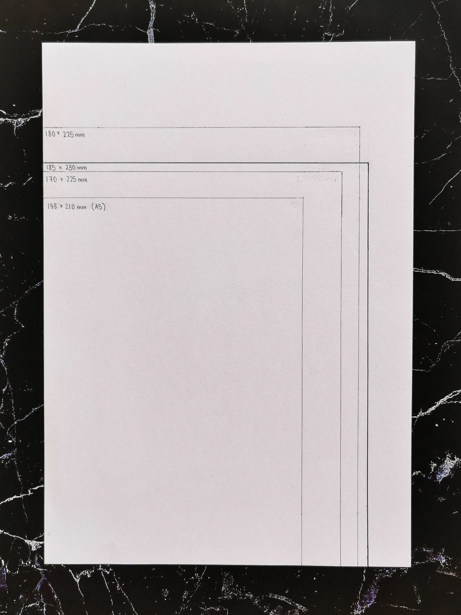 |
| Figure 1.1 Book Size Exploration |
The sizes that I came up with were :
- 170mm x 225mm
- 180mm x 250mm
- 185mm x 230mm (selected)
Below are photos of the book mock up :
 |
| Figure 1.2 Final Book Mock Up |
 |
| Figure 1.3 Final Book Mock Up - Open |
 |
| Figure 1.4 Final Book Mock Up - Rubber Band Binding |
 |
| Figure 1.5 Final Book Mock Up - Flipping GIF |
 |
| Figure 1.6 Final Book Mock Up in comparison to Other Size Explorations |
Exercise 3 - Van De Graff
Week 2 (07/04/21)
We were required to do the Van De Graff exercise on paper as well as in InDesign. Below are the submission for the exercises:
 |
| Figure 1.7 Van De Graff on paper |
 |
| Figure 1.8 Digital Vann De Graff |
 |
| Figure 1.9 Digital Vann De Graff with text |
 |
| Figure 2.1 Digital Vann De Graff with text without guidelines |
Below is the submission of the exercise in PDF format. It is the same as the JPEG submission but the margin guidelines are visible here:
Figure 2.2 Vann De Graff (PDF Submission)
Week 3 (14/04/21)
We worked on this in class, following a tutorial video. We had to fold an A4 paper 3 times so that it would form 8 pages on one side, 16 pages in total. We then numbered the pages when it is folded. Below is the outcome of the folds:
 |
| Figure 2.3 Signature Folding - Front |
 |
| Figure 2.4 Signature Folding - Back |
 |
| Figure 2.5 Signature Folding - Folded |
 |
| Figure 2.6 Signature Folding - Folded, Middle Spread |
We then had to repeat the same process again, but this time we had to trim the edges so that it would look cleaner. Below is the outcome and comparison photos:
 |
| Figure 2.7 Signature Folding - Flip through the trimmed version |
 |
| Figure 2.8 Signature Folding - Comparison of sides for untrimmed (L) and trimmed (R) |
 |
| Figure 2.9 Signature Folding - Comparison of edges for untrimmed (L) and trimmed (R) |
Exercise 5 - Determining Grids
Week 4 (21/04/21)
We had to choose 3 different spreads and determine what grids the designers might have used to create these spread. Below are my submissions:
Figure 3.1 Determining Grids
Figure 3.2 Determining Grids without Spread
Exercise 6 - Form & Movement
Week 4 (21/04/21)
In class, we had to do our exercise for form & movement. Below is my first attempt to the exercise:
Figure 3.3 Form & Movement - Attempt 1
After receiving feedback, I tried another attempt for the exercise:
Figure 3.4 Form & Movement - Attempt 2
Week 5 (28/04/21)
This week, I tried another attempt for the exercise. Below is my progression during class:
Figure 3.5 Form & Movement - Attempt 3
I continued to make amendments on it after class. Below is the final version for this attempt:
Figure 3.6 Form & Movement - Attempt 4
 |
| Figure 3.7 Form & Movement (GIF) |
Week 6 (05/05/21)
After finalizing the B&W version, I moved on by adding colours to it:
Figure 3.8 Form & Movement - Colour
 |
| Figure 3.9 Form & Movement - Colour (GIF) |
Once that was done, I moved on to add the image:
Figure 4.1 Form & Movement - Image
 |
| Figure 4.2 Form & Movement - Image (GIF) |
Finally, I moved on by adding dummy text into the layout. Below is my attempt:
Figure 4.3 Form & Movement - FINAL (GIF)
 |
| Figure 4.4 Form & Movement - FINAL (GIF) |
FEEDBACK
Week 2 (07/04/21)
General Feedback :
Make sure to watch the lectures by week 4. Use the Taylor's Press as our publisher. Google about Creative Common Statement and try to understand it. Can also use fontshare to find free typefaces.
Specific Feedback :
The Taylor's Press address should be in the print details. Spacing between the copywrite statement and name, spacing between ISBN number and print details. Introduction looks a bit short but still ok.
Week 3 (14/04/21)
General Feedback :
Attempt the exercise while you're watching the video.
Specific Feedback :
No specific feedback.
Week 4 (21/04/21)
General Feedback :
Try finding layouts that are more interesting, not things that we are already able to do. Try out different columns and rows number to find roughly what guide the designers used when creating the spreads. There should be points where they touch the guides. Sometimes, the designers might also make a choice to go out from the guide.
Specific Feedback :
For the determine grids, it's fine if the image is blurry. The first one is interesting to look at and dissect, the second one is a normal spread, third one is dissected correctly. For the form & movement, the flow doesn't really make sense. Try to think of how the form moves and be less predictable.
Week 5 (28/04/21)
General Feedback :
The form and movement have to connect from one spread to another. The forms must not be too overwhelming, if not it will take the attention away from the actual information. Our forms should have more versatility if not it will be too predictable, but at the same time the transition from one to another must make sense. Don't introduce too much graphical elements at once.
Specific Feedback :
The one I did during the week was good. The one I did in class, the first 2 spreads are good, the 3rd spread is a bit repetitive from the 2nd. The 3rd and 4th don't really connect well. The rest are fine.
Week 6 (05/05/21)
General Feedback :
The colours should be introduced while also considering the flow of it in the spreads. Try to keep it to 3:7 for the ratio of the colour to black. Not all spreads must have the colour. Similarly, the images don't have to be used in all spreads. Try to be more innovative when it comes to cropping the image. Showcase different perspective, parts of the image. Decide how many columns you want for the text and stick to that. Find a typeface that suits the design.
Specific Feedback :
BW is good. The colour version, might want to revise a bit to see if there are better places to put the colours, but overall there is also a flow for the colours from one spread to another. The image version is good.
REFLECTION
Experiences :
Week 2 (07/04/21); the exercise were okay but my progress was quite slow, especially because my tape kept coming off from the paper so I had to keep adjusting it. Week 3 (14/04/21); the exercise was quite easy to understand. Week 4 (21/04/21); it was really hard for me to find the layouts because the photos I downloaded were really blurry. Some layouts were interesting, but I couldn't find spreads that were flat so it wouldn't be possible for me to dissect. For the form & movement, it was really hard to understand, especially cause I was already really tired at the end of the class. However, I managed to learn more about it during the week while reading the article and looking at the samples of how previous students have done it through the article. Week 5 (28/04/21); I think I'm starting to understand the form & movement activity a bit more, but I find myself a bit trap when thinking of how to connect things while making it look different and spontaneous. Week 6 (05/05/21); This week was a bit stressful for the exercise cause I kept seeing everyone having to redo.
Observations :
Week 2 (07/04/21); I noticed that a lot of my classmates' book size are relatively small (closer to A5) and are longer (mine is wider). I'm not really sure if mine is okay haha. Other than that, my books seems a bit gigantic. Don't know if it's cause my hands are a bit too small so it looks huge when I'm holding it. Week 3 (14/04/21); I notice that my classmates are really fast when doing the exercises, I'm always very slow haha. Week 4 (21/04/21); I notice that I spend a lot of time on things which make me really slow. For example, I take too long to readjust things because I'm too worried it'll be wrong, but then I don't actually have to be THAT cautious that times. Week 5 (28/04/21); I think some of my classmates have really good points, which helps me understand more of the topic. But I think they face the same problem, which is we might understand the basics of it, but not enough for us to just do it casually. Week 6 (05/05/21); I notice that my classmates are really confused with the exercise, which made me confused too.
Findings :
Week 2 (07/04/21); I find InDesign a bit unfamiliar right now since it's been quite awhile since I've used it (compared to the other software, so I might need to look around it and get a bit more familiar with everything. Week 3 (14/04/21); I find that it was really hard to fold the paper evenly as the folds increased. Week 4 (21/04/21); I find it a bit hard for me to think at the end of the class, my brain starts to clog after awhile. Finding reference and reading more about something after class really helps me understand more on a topic. Week 5 (28/04/21); I find it really important to take pictures of the exercises as soon as possible because sometimes accidents might happen and the exercise won't look as good as it was :'( Week 6 (05/05/21); I find it important for me to read and come up with my own interpretations and understanding on the topic if not I'll never know if I really do understand and if my understanding is correct.
FURTHER READINGS
Grid systems in graphic design: A visual communication manual for graphic designers, typographers, and three dimensional designers by Joseph Muller-Brockmann
 |
| Figure 4.5 Grid systems in graphic design book cover |
The use of grid systems are essential as it helps designers to operate with conceptions and organization, leading to efficiency and confidence. Grids are an ordering system contributing to design constructive-wise. Constructive design is capable of influencing and enhancing the taste of society and the way it conceives forms and colours. According to the author, constructivist design means the conversion of design laws into practical solutions.
A good grid system can help:
Printed materials usually follow the standard sizing based on the DIN system. This is because manufacturers can easily stock them up and cutting machines also have specific standardized dimensions which matches the paper sizes of the DIN system. A size outside the DIN system must be obtained by having a larger size than required for the paper used for printing, and then trimming it afterwards. IT can also be done by manufacturing the size specifically, but both approaches increase production costs.
The typographic measuring system is constructed and named after the Parisian typefounder Firmin Didot. The Didot system correlated with the French foot of 30cm, which measurers 798 typographic points. In conventional typography the size of the type is measured in points. The top to bottom of a type is called "point size" or "body" and the width of the letters is called the "set" or "width".
A good grid system can help:
- construct argument objectively with the means of visual communication
- construct the text and illustrative material systematically and logically
- organize the text and illustrations in a compact arrangement with its own rhythm
- as a design solution that saves time (helps designers decide better)
Printed materials usually follow the standard sizing based on the DIN system. This is because manufacturers can easily stock them up and cutting machines also have specific standardized dimensions which matches the paper sizes of the DIN system. A size outside the DIN system must be obtained by having a larger size than required for the paper used for printing, and then trimming it afterwards. IT can also be done by manufacturing the size specifically, but both approaches increase production costs.
The typographic measuring system is constructed and named after the Parisian typefounder Firmin Didot. The Didot system correlated with the French foot of 30cm, which measurers 798 typographic points. In conventional typography the size of the type is measured in points. The top to bottom of a type is called "point size" or "body" and the width of the letters is called the "set" or "width".

Comments
Post a Comment