TYPOGRAPHY - FINAL PROJECT
TYPOGRAPHY - FINAL PROJECT

30/10/19 - 20/11/19 (Week 10 - Week 13)
Chan Jing Wen (0340480)
Typography
Final Project
LECTURE NOTES
LECTURE 10
30/10/19 (Week 10)
There was no lecture.
LECTURE 11
06/11/19 (Week 11)
There was no lecture.
LECTURE 12
13/11/19 (Week 12)
There was no lecture.
INSTRUCTIONS
FINAL PROJECT
Week 10 (30/10/19)
Initially, my manifesto was "Design shapes Society". I sketched my ideas out in my notebook.
I went to Mr Vinod for feedback and he said that it would be better if I maximize the amount of space of the canvas that I used. The left draft is mine and the right one is Mr Vinod's comment. Upon receiving feedback, Mr Vinod announced that we could do it in any language. I then thought of doing it in Mandarin with the line "绘出社会" which loosely means "Design shapes Society".
Basically, "绘"; pronounced as "hui"; is to draw/design, "社会"; pronounced as "she hui"; is society. "绘出社会"; pronounced as "hui chu she hui"; can be interpreted as "design our society" or "design shapes society" depending on how you break the sentence.
I wanted to play with the words "绘" and "会"; both pronounced "hui"; since they had the same characters. After showing Mr Vinod my sketched, he suggested that I draw the draft of my design using the materials that I would be using and also show it to my classmates and non-classmates who understood Mandarin to check if they understood my protest.
I received mixed feedback. Most of my classmates could understand the design. However, my friends outside our class couldn't really spell out the exact sentence but they could understand the meaning of it. The majority of the people I showed my draft to told me that they preferred the first idea over the second one.
One feedback that I received from my classmate was that I could add something to guide the audience to read the board correctly. In the end, I went on to Illustrator to edit some lines at the back of the piece. Since this is just a quick sketch as a better reference, I didn't use the typeface that I wanted to use on the actual board. I just wanted to ensure that the positioning of everything isn't too awkward.
I then went on to the creation of the board. I started by sketching the layout onto the board.
This is my final outcome. I used Chinese calligraphy for the black typography, red poster colour for the red typography and a white pen for the lines.
Week 11 (06/11/19)
After Mr Vinod gave us the instructions for our next step, I went on to Adobe Illustrator to draw out the posters.
Since it didn't have a translation, I decided to include the translation into the poster.
I then created another version with a white background.
After that, Mr Vinod went around the classroom to give everyone feedback. He told me that I should try a different layout and not reuse the original one I did for the protest board.
I then went on to try other layouts. Below are my other attempts :
For the four attempts, the layout and fonts really finalized. However, before getting to further edit it, my computer started to malfunction (on the day of the project itself) and eventually it broke down. The illustration file is gone now since I didn't save it after creating the 4 new attempts. I only have an older version of the illustration file which only consist of the first few attempts :
Luckily I exported the attempts every time I "finished" them, so at least I have the drafts of the ideas.
Based on the drafts, I tried redoing everything.
I started by redoing attempt 1 and 2. I changed the typeface for the text "Design Shapes Society" since I couldn't find the original typeface and I didn't like the original one either.
After that, I wanted to redo the 3rd and 4th attempt but I didn't really like the outcome of the previous attempts so I just used the concept of the attempts to remake other attempts. I wanted to show "shaping society" by having things organized and in a box.
I liked how I did the word "society" so I played around with the typeface. However, I wasn't really sure about the layout so I was stuck here. While creating this, I related it back to my previous attempt where I highlighted the word "city". Instead of highlighting "city", I wanted to highlight that you can't spell "society" with the help of "design" so I highlighted the letters that were in common.
While doing that, I thought of the concept of "removing" the letters from the word "design" and then "pasting" them onto society, as if they were stickers. Therefore, you can see that in this exploration, the letters "e", "s", and "i" are white because it symbolizes that the letters are teared out to be stick to fill in the respective spaces in the word "society".
As I was thinking of making the letters into stickers, I made the letter "I" seem like it's being stuck onto and changed the colour and layout of the text since the previous one was a bit too striking.
Looking at a previous exploration, I thought the layout made it look like the Buncho Poster Colour. So, I made the text "design" as the cap, the text "shape" being the screw part, and "society" as the label of the poster colour.
While finishing up the previous exploration, I noticed that I didn't include the mandarin text. :) I wasn't really sure of it would be acceptable so I tried to include the Chinese characters inside. I made it as it was the logo. Also, for the previous exploration, I actually made the borders for society black (figure 2.14 is the edited version). I changed it here to be red because I wanted it to tie with the brush stroke on the Chinese character. Since my idea for the Chinese character was that the red part of the text was painted on to show "Design Shapes Society/Design Society", I think by making the paint red would make more sense.
Here is another attempt. I don't like it, it gives me an impression that society leads to design since i illustrated "SHAPES" into a lader. Also, I didn't really know what to add or what to do with it anymore so I didn't continue on this idea.
Week 12 (13/11/19)
In class, I showed my classmates my posters and I changed it up a bit based on the feedback.
Back at attempt 5, I changed the colour to it because the red was a bit too sharp and almost everyone was doing red.
After receiving feedback, I created more designs.
After creating the 3 new designs, I went to show Mr Shamsul the new layout. He said he prefers Attempt 02 over the new 3 designs and gave me feedback on how I can improve it. He didn't really ask me to change anything, he just asked me to make sure the mandarin character is right in the middle.
After letting Mr Shamsul check once more, I asked him about the animation I had in mind and he said that it's fine. For my idea, he wanted me to make sure that the strokes really appear one by one.
At home, I started working on my animation. First of all, I copied the final still image into a new file. This is because we cannot work on A3 as it will crash, so I changed it to an A4 canvas.
Unlike roman letters, Adobe Illustrator cannot outline the stroke of Chinese characters so I manually drew the outline of the stroke.
I zoomed in and cut the anchors which I wanted the stroke to end so the final outcome would look like the entire thing slowly appears.
As above, the parts are separated after cutting.
I removed it. This would continue for every artboard so the stroke would gradually appear once I flip the whole animation around.
Since the flat surface looked very awkward, I extended it to look like the end of a brush stroke.
In total I used 24 artboards for the animation.
I then insert all the artboards into Photoshop to create the frame animation. All of the artboards have no delay except the first one being 0.5s and last one being 1s.
Here is the outcome of the animated still. The outcome was very shaky so I decided to adjust the layers in Illustrator.
I removed all the existing background from the artboard except the primary one.
I then grouped everything except the red stroke so it would be easier for me to carry out the following steps.
I copy and paste the new background onto the next background. I let it align to the center of the artboard horizontally.
I then centered the background vertically. Together, the background now is right in the center of the artboard and should fit perfectly on the artboard.
I repeated all these steps for every artboard.
Creating the animation, the GIF still turned out shaky which I was a bit confused.
However, here are my final outcome :
FEEDBACK
Week 10 (30/10/19)
General Feedback :
We should focus on the typography that we use instead of adding extra illustrations to the protest board.
Specific Feedback :
Mr Vinod said that I should refer to people (outside our classroom) for feedback. The feedback I received was that all of them (I asked 6 people in total) preferred the first idea more than the second one. They didn't actually spell out the correct sentence but somehow all of them could interpret the meaning behind it. In short, they wrote the sentence differently but it was the same exact meaning to the phrase I was using. One of them told me that I shouldn't put the circle outside the word because it looked like another word so I eventually inverse the colours. I also asked my classmates (6 in total). Most of them preferred the first idea and they didn't have trouble understanding the phrase and the concept. However, one of my classmates stated that I should add something to help guide people in seeing the actual sentence.
Week 11 (06/11/19)
General Feedback :
Regarding our project 2, our typeface point size should be bigger because the idea of the layout is to sell the typeface. If we want to adjust it again, we can but we should inform them once we edit it. Mr Vinod also reminded us that our PDF files must be public. We should check if it's accessible by using a private browser.
Specific Feedback :
Mr Vinod said that I should try a different layout instead of using the same one as my protest board.
Week 12 (13/11/19)
General Feedback :
"Distorting a typeface leads to an immediate failure." We can only distort it IF we get their approval, or else it'll just be ugly. Our animation should be RGB, we should also work on an A4 canvas instead of A3, or it will crash.
Specific Feedback :
(1) Mr Vinod said that I shouldn't leave out the mandarin characters. He wanted to me to try other layouts.
(2) After a few more attempts, I showed Mr Shamsul my attempts and he chose one of the early designs. He said that I must make sure the characters are really center aligned and that the English translation is fine.
REFLECTION
EXPERIENCE
Week 10 (30/10/19); I was shocked when Mr Vinod told us that he wanted us to get everything done by the day itself because I thought the protest board was our entire final project. This experience was definitely different from before cause we had a limited amount of time and I didn't have a manifesto in mind before the class. However, it was quite fun as this was the first time we did something manually if I don't include the drafts and sketches. I'm very happy that I got to do Chinese Calligraphy again although it wasn't actually the same as how I did it in school before. Week 11 (06/11/19); I was a bit sad this week because I had to redo a lot of stuff for all of my subjects since my laptop broke down and most of the files were either gone or corrupted. Week 12 (13/11/19); After getting approval for the poster, I moved on to animation and I feel like it was kind of fun. I was also a bit excited since it was the last thing to do (?) for the subject.
OBSERVATION
Week 10 (30/10/19); I noticed that a lot of the colours used among my classmates were black and red. I think it's because it's one of the most efficient ways to grab attention. I also noticed that a lot of people actually used Mandarin in their board, which I think is quite cool because we can actually write more words onto the board using Mandarin since every character has its meaning. Other than Mandarin, there were also different languages used such as Bahasa Melayu and Arabic, which I feel is very relevant to this project. If the language that we choose can help bring out our beliefs the best, then it becomes our own manifesto. Week 11 (06/11/19); I notice that it was actually hard thinking about a layout that would really bring out the meaning of the text and that it was even harder to bring two languages together in one layout and make everything come together as a whole composition. Week 12 (13/11/19); Mr Vinod asked me to observe the other students who also did their project in Mandarin. I really liked theirs because it was really bold. However, it was a bit hard for me to work with mine since I only had 2-4 characters depending on the layout I chose so I was a bit stuck. But it really did inspire me!
FINDINGS
Week 10 (30/10/19); I find it hard to use a brush to do Chinese Calligraphy. If I new I would be using it to write actual calligraphy, I would have brought my calligraphy brush. Week 11 (06/11/19); I find that it's very crucial that I constantly save my work and that I should have back up. I usually back up my files after finishing an assignment up on Google Drive, but I think from now on I should back up my files once in awhile on both Google Drive and a pendrive. I usually upload my research, raw materials, process, and everything onto Drive asap but I never upload the actual Photoshop, Illustration, InDesign files anywhere as back up during the process SO I think I should from now on. Week 12 (13/11/19); I find that it's really hard to think of a layout when there's only a few characters to use. Also, I think my creativity was a bit constrained since I liked the first sketch a lot and I just keep feeling like I wouldn't create a better one.
FURTHER READING
TYPOGRAPHIC SYSTEMS by Kimberly Elam
30/10/19 - 06/11/19 (Week 10 - Week 11)
There are 8 systems mentioned in this book :
1. Axial System
13/11/19 - 20/11/19 (Week 12 - Week 13)
The author says that the way books are read hasn't really change for the past few hundred years. Publishers try to fit as much text as possible in one page because it cost less and they're not willing to pay more for a good typeface. Not only do they pass on a good typeface, they do not focus on the design of the book, sometimes even the cover of the book. Even until now where technology advancement allows us to access book electronically, publishers neglect the importance of a good typeface even if it cost less that a printed book.
In the advertisement industry, it seems that there is a generic style. The style mentioned in the book was "headline on top, attention-grabbing picture underneath, subhead, main copy, logo, pay-off line, address, URL, or telephone number." The author says that this is too much for us to comprehend. It actually reduces the chance of people reading the actual advertisement.

30/10/19 - 20/11/19 (Week 10 - Week 13)
Chan Jing Wen (0340480)
Typography
Final Project
LECTURE NOTES
LECTURE 10
30/10/19 (Week 10)
There was no lecture.
LECTURE 11
06/11/19 (Week 11)
There was no lecture.
LECTURE 12
13/11/19 (Week 12)
There was no lecture.
INSTRUCTIONS
FINAL PROJECT
Week 10 (30/10/19)
Initially, my manifesto was "Design shapes Society". I sketched my ideas out in my notebook.
 |
| Figure 1.1 First Attempt |
I went to Mr Vinod for feedback and he said that it would be better if I maximize the amount of space of the canvas that I used. The left draft is mine and the right one is Mr Vinod's comment. Upon receiving feedback, Mr Vinod announced that we could do it in any language. I then thought of doing it in Mandarin with the line "绘出社会" which loosely means "Design shapes Society".
 |
| Figure 1.2 Meaning of the Manifesto |
Basically, "绘"; pronounced as "hui"; is to draw/design, "社会"; pronounced as "she hui"; is society. "绘出社会"; pronounced as "hui chu she hui"; can be interpreted as "design our society" or "design shapes society" depending on how you break the sentence.
 |
| Figure 1.3 Second Attempt Sketches |
I wanted to play with the words "绘" and "会"; both pronounced "hui"; since they had the same characters. After showing Mr Vinod my sketched, he suggested that I draw the draft of my design using the materials that I would be using and also show it to my classmates and non-classmates who understood Mandarin to check if they understood my protest.
 |
| Figure 1.4 Refined draft |
I received mixed feedback. Most of my classmates could understand the design. However, my friends outside our class couldn't really spell out the exact sentence but they could understand the meaning of it. The majority of the people I showed my draft to told me that they preferred the first idea over the second one.
 |
| Figure 1.5 Illustrated version |
One feedback that I received from my classmate was that I could add something to guide the audience to read the board correctly. In the end, I went on to Illustrator to edit some lines at the back of the piece. Since this is just a quick sketch as a better reference, I didn't use the typeface that I wanted to use on the actual board. I just wanted to ensure that the positioning of everything isn't too awkward.
 |
| Figure 1.6 Sketch on Board |
I then went on to the creation of the board. I started by sketching the layout onto the board.
 |
| Figure 1.7 Close up of the board |
 |
| Figure 1.8 Board full length view |
 |
| Figure 1.9 Me and the board |
This is my final outcome. I used Chinese calligraphy for the black typography, red poster colour for the red typography and a white pen for the lines.
Week 11 (06/11/19)
After Mr Vinod gave us the instructions for our next step, I went on to Adobe Illustrator to draw out the posters.
 |
| Figure 2.1 Illustrated Protest Board |
Since it didn't have a translation, I decided to include the translation into the poster.
 |
| Figure 2.2 Illustrated Protest Board with Translation |
I then created another version with a white background.
 |
| Figure 2.3 Illustrated Protest Board with translation (white ver.) |
After that, Mr Vinod went around the classroom to give everyone feedback. He told me that I should try a different layout and not reuse the original one I did for the protest board.
I then went on to try other layouts. Below are my other attempts :
 |
| Figure 2.4 Attempt 01 |
 |
| Figure 2.5 Attempt 02 |
 |
| Figure 2.6 Attempt 03 |
 |
| Figure 2.7 Attempt 04 |
For the four attempts, the layout and fonts really finalized. However, before getting to further edit it, my computer started to malfunction (on the day of the project itself) and eventually it broke down. The illustration file is gone now since I didn't save it after creating the 4 new attempts. I only have an older version of the illustration file which only consist of the first few attempts :
 |
| Figure 2.8 Screenshot of the remaining files |
Luckily I exported the attempts every time I "finished" them, so at least I have the drafts of the ideas.
Based on the drafts, I tried redoing everything.
I started by redoing attempt 1 and 2. I changed the typeface for the text "Design Shapes Society" since I couldn't find the original typeface and I didn't like the original one either.
 |
| Figure 2.9 Attempt 01 Edit 02 |
 |
| Figure 2.10 Attempt 02 Edit 02 |
After that, I wanted to redo the 3rd and 4th attempt but I didn't really like the outcome of the previous attempts so I just used the concept of the attempts to remake other attempts. I wanted to show "shaping society" by having things organized and in a box.
 |
| Figure 2.11 Attempt 05 Exploration 01 |
I liked how I did the word "society" so I played around with the typeface. However, I wasn't really sure about the layout so I was stuck here. While creating this, I related it back to my previous attempt where I highlighted the word "city". Instead of highlighting "city", I wanted to highlight that you can't spell "society" with the help of "design" so I highlighted the letters that were in common.
 |
| Figure 2.12 Attempt 05 Exploration 02 |
While doing that, I thought of the concept of "removing" the letters from the word "design" and then "pasting" them onto society, as if they were stickers. Therefore, you can see that in this exploration, the letters "e", "s", and "i" are white because it symbolizes that the letters are teared out to be stick to fill in the respective spaces in the word "society".
 |
| Figure 2.13 Figure Attempt 05 Exploration 03 |
As I was thinking of making the letters into stickers, I made the letter "I" seem like it's being stuck onto and changed the colour and layout of the text since the previous one was a bit too striking.
 |
| Figure 2.14 Attempt 05 Exploration 04 |
Looking at a previous exploration, I thought the layout made it look like the Buncho Poster Colour. So, I made the text "design" as the cap, the text "shape" being the screw part, and "society" as the label of the poster colour.
 |
| Figure 2.15 Attempt 05 Exploration 05 |
While finishing up the previous exploration, I noticed that I didn't include the mandarin text. :) I wasn't really sure of it would be acceptable so I tried to include the Chinese characters inside. I made it as it was the logo. Also, for the previous exploration, I actually made the borders for society black (figure 2.14 is the edited version). I changed it here to be red because I wanted it to tie with the brush stroke on the Chinese character. Since my idea for the Chinese character was that the red part of the text was painted on to show "Design Shapes Society/Design Society", I think by making the paint red would make more sense.
 |
| Figure 2.16 Attempt 06 |
Here is another attempt. I don't like it, it gives me an impression that society leads to design since i illustrated "SHAPES" into a lader. Also, I didn't really know what to add or what to do with it anymore so I didn't continue on this idea.
Week 12 (13/11/19)
In class, I showed my classmates my posters and I changed it up a bit based on the feedback.
 |
| Figure 3.1 Attempt 05 Exploration 06 |
 |
| Figure 3.2 Attempt 05 Exploration 07 |
Back at attempt 5, I changed the colour to it because the red was a bit too sharp and almost everyone was doing red.
After receiving feedback, I created more designs.
 |
| Figure 3.3 Attempt 06 |
 |
| Figure 3.4 Attempt 07 |
 |
| Figure 3.5 Attempt 08 |
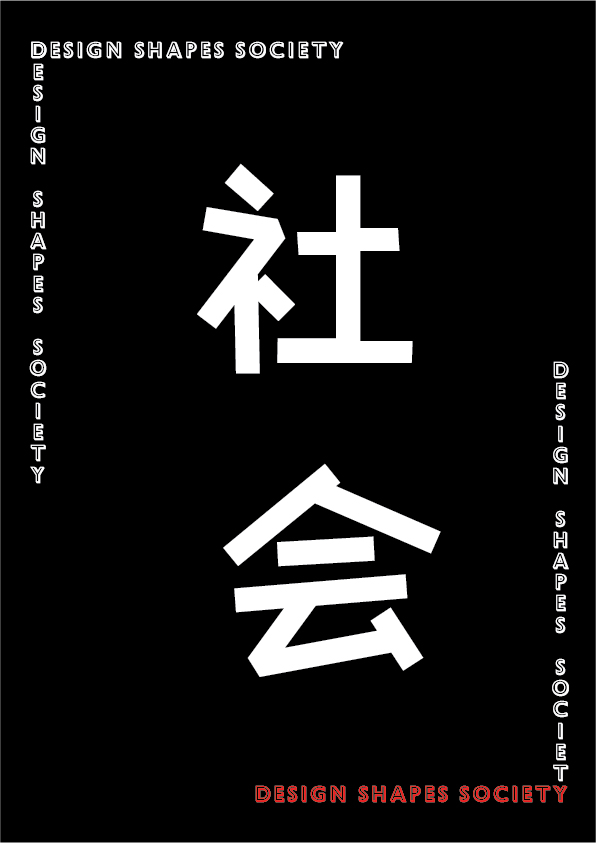
After creating the 3 new designs, I went to show Mr Shamsul the new layout. He said he prefers Attempt 02 over the new 3 designs and gave me feedback on how I can improve it. He didn't really ask me to change anything, he just asked me to make sure the mandarin character is right in the middle.
 |
| Figure 3.6 Final Still Edit |
 |
| Figure 3.7 Screenshot of all artboards |
After letting Mr Shamsul check once more, I asked him about the animation I had in mind and he said that it's fine. For my idea, he wanted me to make sure that the strokes really appear one by one.
At home, I started working on my animation. First of all, I copied the final still image into a new file. This is because we cannot work on A3 as it will crash, so I changed it to an A4 canvas.
 |
| Figure 3.8 Outlining the red part |
Unlike roman letters, Adobe Illustrator cannot outline the stroke of Chinese characters so I manually drew the outline of the stroke.
 |
| Figure 3.9 Cutting the anchor |
I zoomed in and cut the anchors which I wanted the stroke to end so the final outcome would look like the entire thing slowly appears.
 |
| Figure 3.10 Separated parts |
As above, the parts are separated after cutting.
 |
| Figure 3.11 Removing the part |
I removed it. This would continue for every artboard so the stroke would gradually appear once I flip the whole animation around.
 |
| Figure 3.12 Extending the stroke |
Since the flat surface looked very awkward, I extended it to look like the end of a brush stroke.
 |
| Figure 3.13 Screenshot of the artboards |
In total I used 24 artboards for the animation.
 |
| Figure 3.14 Screenshot from Photoshop |
I then insert all the artboards into Photoshop to create the frame animation. All of the artboards have no delay except the first one being 0.5s and last one being 1s.
 |
| Figure 3.15 Animated Still |
Here is the outcome of the animated still. The outcome was very shaky so I decided to adjust the layers in Illustrator.
 |
| Figure 3.16 Removing all backgrounds |
I removed all the existing background from the artboard except the primary one.
 |
| Figure 3.17 Grouping elements |
I then grouped everything except the red stroke so it would be easier for me to carry out the following steps.
 |
| Figure 3.18 Center Horizontal Alignment |
I copy and paste the new background onto the next background. I let it align to the center of the artboard horizontally.
 |
| Figure 3.19 Center Vertical Alignment |
I then centered the background vertically. Together, the background now is right in the center of the artboard and should fit perfectly on the artboard.
I repeated all these steps for every artboard.
Creating the animation, the GIF still turned out shaky which I was a bit confused.
However, here are my final outcome :
 |
| Figure 3.20 Still Image (JPEG) |
Figure 3.21 Still Iamge (PDF)
 |
| Figure 3.22 Animated Still |
 |
| Figure 3.23 Displayed version in frame |
FEEDBACK
Week 10 (30/10/19)
General Feedback :
We should focus on the typography that we use instead of adding extra illustrations to the protest board.
Specific Feedback :
Mr Vinod said that I should refer to people (outside our classroom) for feedback. The feedback I received was that all of them (I asked 6 people in total) preferred the first idea more than the second one. They didn't actually spell out the correct sentence but somehow all of them could interpret the meaning behind it. In short, they wrote the sentence differently but it was the same exact meaning to the phrase I was using. One of them told me that I shouldn't put the circle outside the word because it looked like another word so I eventually inverse the colours. I also asked my classmates (6 in total). Most of them preferred the first idea and they didn't have trouble understanding the phrase and the concept. However, one of my classmates stated that I should add something to help guide people in seeing the actual sentence.
Week 11 (06/11/19)
General Feedback :
Regarding our project 2, our typeface point size should be bigger because the idea of the layout is to sell the typeface. If we want to adjust it again, we can but we should inform them once we edit it. Mr Vinod also reminded us that our PDF files must be public. We should check if it's accessible by using a private browser.
Specific Feedback :
Mr Vinod said that I should try a different layout instead of using the same one as my protest board.
Week 12 (13/11/19)
General Feedback :
"Distorting a typeface leads to an immediate failure." We can only distort it IF we get their approval, or else it'll just be ugly. Our animation should be RGB, we should also work on an A4 canvas instead of A3, or it will crash.
Specific Feedback :
(1) Mr Vinod said that I shouldn't leave out the mandarin characters. He wanted to me to try other layouts.
(2) After a few more attempts, I showed Mr Shamsul my attempts and he chose one of the early designs. He said that I must make sure the characters are really center aligned and that the English translation is fine.
REFLECTION
EXPERIENCE
Week 10 (30/10/19); I was shocked when Mr Vinod told us that he wanted us to get everything done by the day itself because I thought the protest board was our entire final project. This experience was definitely different from before cause we had a limited amount of time and I didn't have a manifesto in mind before the class. However, it was quite fun as this was the first time we did something manually if I don't include the drafts and sketches. I'm very happy that I got to do Chinese Calligraphy again although it wasn't actually the same as how I did it in school before. Week 11 (06/11/19); I was a bit sad this week because I had to redo a lot of stuff for all of my subjects since my laptop broke down and most of the files were either gone or corrupted. Week 12 (13/11/19); After getting approval for the poster, I moved on to animation and I feel like it was kind of fun. I was also a bit excited since it was the last thing to do (?) for the subject.
OBSERVATION
Week 10 (30/10/19); I noticed that a lot of the colours used among my classmates were black and red. I think it's because it's one of the most efficient ways to grab attention. I also noticed that a lot of people actually used Mandarin in their board, which I think is quite cool because we can actually write more words onto the board using Mandarin since every character has its meaning. Other than Mandarin, there were also different languages used such as Bahasa Melayu and Arabic, which I feel is very relevant to this project. If the language that we choose can help bring out our beliefs the best, then it becomes our own manifesto. Week 11 (06/11/19); I notice that it was actually hard thinking about a layout that would really bring out the meaning of the text and that it was even harder to bring two languages together in one layout and make everything come together as a whole composition. Week 12 (13/11/19); Mr Vinod asked me to observe the other students who also did their project in Mandarin. I really liked theirs because it was really bold. However, it was a bit hard for me to work with mine since I only had 2-4 characters depending on the layout I chose so I was a bit stuck. But it really did inspire me!
FINDINGS
Week 10 (30/10/19); I find it hard to use a brush to do Chinese Calligraphy. If I new I would be using it to write actual calligraphy, I would have brought my calligraphy brush. Week 11 (06/11/19); I find that it's very crucial that I constantly save my work and that I should have back up. I usually back up my files after finishing an assignment up on Google Drive, but I think from now on I should back up my files once in awhile on both Google Drive and a pendrive. I usually upload my research, raw materials, process, and everything onto Drive asap but I never upload the actual Photoshop, Illustration, InDesign files anywhere as back up during the process SO I think I should from now on. Week 12 (13/11/19); I find that it's really hard to think of a layout when there's only a few characters to use. Also, I think my creativity was a bit constrained since I liked the first sketch a lot and I just keep feeling like I wouldn't create a better one.
FURTHER READING
TYPOGRAPHIC SYSTEMS by Kimberly Elam
30/10/19 - 06/11/19 (Week 10 - Week 11)
 |
| Figure 4.1 Typographic System |
There are 8 systems mentioned in this book :
1. Axial System
- Elements are organized based on a single axis.
- It can be a centered axis, whereby the axis cuts the poster in half.
- To make things interesting and not having everything too symmetrical, there can be a center square, where everything is aligned to it, but the center square isn't at the center of the poster but aligned vertically to the center of the poster.
- The line creating the axis can be straight, zigzag, or even curved.
- Elements move towards a center point.
- The elements seem to radiate from a center point as the elements are aligned on the radius from the center point.
- Radial is a bit hard to read, but it's an interactive style that can be used in posters or even websites.
- Text are set along circular paths.
- Rather than radiating out from a point like the radial designs, the text forms curves around a point.
- It's actually tricky to use because a longer text might outline the entire circle, which would cause the beginning of the text to be upside down.
- Therefore, it's only suitable for smaller amount of text and it's mostly found in posters.
- Just as it suggest, the elements are all placed randomly.
- This system is actually quite messy, therefore it's not suitable if the target is to make the text readable.
- However, it's a fun interactive system for something that is more illustrative.
- A grid helps fit text neatly in columns and rows.
- It actually requires basic math and calculation since you have to calculate the distance of columns and rows to find a perfect fit for the layout.
- It promotes readability.
- It can work well in anything including books, posters, cards, and more.
- This system shows movement.
- It may be a little bit messy so it's not really good with heavy text.
- However, it can be use as an interactive design for posters, websites, and more that wouldn't require too much text.
- Modular layouts use repeating structures to break up the content.
- These structures can be basically anything: shapes are the most common.
- Everything is centered.
- When everything is centered, it makes the design look symmetrical.
- However, if the text aren't really symmetrical, it becomes very obvious with this system.
13/11/19 - 20/11/19 (Week 12 - Week 13)
 |
| Figure 4.2 STOP STEALING SHEEPS & find out how type works |
The author says that the way books are read hasn't really change for the past few hundred years. Publishers try to fit as much text as possible in one page because it cost less and they're not willing to pay more for a good typeface. Not only do they pass on a good typeface, they do not focus on the design of the book, sometimes even the cover of the book. Even until now where technology advancement allows us to access book electronically, publishers neglect the importance of a good typeface even if it cost less that a printed book.
In the advertisement industry, it seems that there is a generic style. The style mentioned in the book was "headline on top, attention-grabbing picture underneath, subhead, main copy, logo, pay-off line, address, URL, or telephone number." The author says that this is too much for us to comprehend. It actually reduces the chance of people reading the actual advertisement.


Comments
Post a Comment