TYPOGRAPHY - PROJECT 2
TYPOGRAPHY - PROJECT 2

09/10/19 - 30/10/19 (Week 7 - Week 10)
Chan Jing Wen (0340480)
Typography
Project 2
LECTURE NOTES
LECTURE 7 : Describing letterform and typeface, Briefing on Project 2
09/10/19 (Week 7)
Below are some terms used to describe letterform :
Baseline : The imaginary line the visual base of the letterforms.
Median : The imaginary line defining the x-height of letterforms.
X-height : The height in any typeface of the lowercase 'x'.
Cap height : The height of a capital letter above the baseline.
Ascender height : The height of an ascender (the upward stem of a lowercase letter) above the baseline.
* Ascender must exceed the cap height slightly, almost unnoticeably because an uppercase letter tends to look bigger than a lowercase letter. It has to exceed so aesthetic balance is achieved.
Descender height :The height of a descender (the downward stem of a lowercase letter) below the baseline.
Stroke : Any line that defines the basic letterform.
Apex/Vertex : The point created by joining two diagonal stems.
Arm : Short strokes off the stem of the letterform, either horizontal or vertical.
Ascender : The portion of the stem of a lowercase letter that projects above the median.
Barb : The half-serif finish on some curved stroke.
Beak : The half-serif finish on some horizontal arms.
Bowl : The rounded form that describes a counter. The bowl may be either open or close.
Bracket : The transition between the serif and the stem.
Cross Bar : The horizontal stroke in a letterform that joins two stems together.
Cross Stroke : The horizontal stroke across the stem of a lowercase.
Crotch : The interior space where two strokes meet.
Descender : The portion of the stem of a lowercase letter that projects below the baseline.
Ear : The stroke extending out from the main stem or body of the letterform.
Em space : The size of the typeface. (Refers to the width of the letter "M", the biggest letter.)
Em dash, - : Used when you have a sentence between a sentence.
En space : Half the width of an Em. (refers to the width of the letter "N", half the size of the letter "M".)
En dash : Used when we want to replace the word "to", eg : 1997-2000.
Hyphen, - : When there's a word break, to join two words, eg : half-serif.
Finial : The rounded non-serif terminal to a stroke.
Leg : Short stroke off the stem of the letterform, either at the bottom of the stroke or inclined downward.
Ligature : The character formed by the combination of two letterform.
Link : The stroke that connects the bowl and the loop of a lowercase "g".
Loop : In some typeface, the bowl creates the descender of a lowercase "g".
Serif : The right-angled or oblique foot at the end of the stroke.
Shoulder : The curved stroke that is not part of a bowl.
Spine : The curved stem of a "S".
Spur : The extension that articulates the junction of the curved and rectilinear stroke.
Stem : The significant vertical or oblique stroke.
Stress : The orientation of the letterform, indicated by the thin stroke in round form.
Swash : The flourish that extends the stroke of the letterform.
Tail : The curved diagonal stroke at the finish of certain letterform.
Terminal : The self-contained finish of a stroke without a serif. Terminals may be flat, flared, acute, grave, concave, convex, or rounded as a ball or a teardrop (like finial).
Below are some basic terms used to describe fonts :
Uppercase : Capital letters.
Lowercase : Lowercase letters include the same characters as uppercase.
* Uppercase and Lowercase letters are named as it is due to uppercase letters being stored in the upper case and lower case letters being stored in the lower case.
Small Capitals : Uppercase letterforms draw to the x-height of the typeface. Small Caps are primarily found in serif fonts as part of what is often called expert set.
* Most type software includes a style command that generates a small cap based on uppercase forms. Do not confuse real small caps with those artificially generated.
Uppercase Numerals : (aka lining figure) These numerals are the same height as uppercase letters and are all set to the same kerning width.
Lowercase Numerals : (aka non-aligned numerals, old style figure, text figure) These numerals are set to x-height with ascenders and descenders. They are best used when ever you would use upper and lowercase letterforms.
Punctuation, miscellaneous character : Although all fonts contain standard punctuation marks, miscellaneous characters can change from typeface to typeface.
Ornaments : Used as flourishes in certificates or invitations. They are usually provided as a font in a larger typeface family.
Below are the terms used in describing typefaces :
Roman : The letterform is so called because the uppercase forms are derived from inscriptions of Roman monuments. A slightly lighter stroke in roman is known as "Book".
Book : It is meant for typesetting a large amount of text as some roman fonts are too thick to read.
Italic : Most fonts today are produced with a matching italic. It mimics the hand writing of Italians in the fifteenth century.
* Italics was originally a type family itself
Oblique : It is based on Roman form of typeface but slightly slanted to give a Italic effect. It does not follow the writing culture, same as san serif.
Boldface : Thicker stroke variation of Roman. Types are "semibold", "medium", "black", "extra bold", "superbold" and even "poster".
Light : Lighter stroke of Roman. An even lighter stroke would be "thin".
Condense : A version of Roman which is extremely condensed. Can also be known as "compressed".
Extended : An extended version of Roman.
*Typeface reflects the time period.
* & was actually the 27th letter.
LECTURE 8 : Letters
16/09/19 (Week 8)
Some uppercase letters (eg : "A") look symmetrical but if you dissect it, you can see that it's not. For serifs, there are different arcs for each of them. The strokes might also have different width. This is because these little details are what makes the letters harmonious.
X-height generally describes the height of lowercase letters. However, curved strokes such as in "s" must rise above the median or sink below the baseline in order for them to seem aligned with the other letters.
When letters are joined to form words, the counterform includes the space between them. Counter is the negative space between letters. There must be a balance between form and counter so the words are easy to read.
LECTURE 9
23/09/19 (Week 9)
I was absent for this lecture but I asked my classmates for updates. They said that there was no lecture and that Mr Vinod just had them continue on Project 2.
LECTURE 10
30/10/19 (Week 10)
There was also no lecture this week. Mr Vinod and Mr Shamsul went around class to check on our Project 2. After that was the introduction of the first part of our Final Project.
INSTRUCTIONS
PROJECT 2
Week 7 (09/10/19)
We were given the letters and punctuations : "d", "g", "i", "s", "n", "o", "e", "h", "t", "k", "r", "!", "." and ",".
For this project, we have to create a typeface based on the typeface we selected. I chose ITC New Baskerville Regular.
For our first step, we were told to dissect 5 of the letters from the typeface we chose. I chose to dissect the letters "h", "i", "d", "e" and "s".
Below are the letters dissected :
After dissecting, I understood more on how this typeface is. My understanding was that all the curves aren't composed by just one circle. The serifs for "H" and "I" aren't actually straight.
I went on to sketch my typeface. My idea was that I wanted my letters to be composed by basic circles. I didn't want my serifs to be straight but in stead of having it curve inwards I did it outwards. I also wanted to keep the thickness even.
I started by sketching the letters on my sketchbook. I realize that it was too hard for me to figure the sizing of the letters and everything so I redid it on graph paper.
I started by sketching ovals. I tried to keep all the width of the ovals the same. For letters like "G" and "S", I had to decrease the size of the ovals but I tried to keep the dimensions as equal as possible.
I then went on to sketch out the letters. At this point, I wasn't very sure if the letters were how I wanted them to be so I redid some of the letters.
As above, I changed the design of "T", "S", "N", "E" and "H".
After sketching, I initially wanted to do my illustration straight away. However, while I was illustrating, I noticed a problem here. My artboard could not fit my ascender and descender. I wasn't really sure if it was okay because I remember that Mr Vinod mentioned how a good typeface will usually not have a long ascender and descender so I decided to re-sketch my letters with a smaller ascender and descender. However, I still illustrated "i", "r", and "s" since they aren't affected too much by the ascender and descender height.
However, I felt that my idea was really simple and I wasn't sure if I liked it so I sketched another one. For this attempt, I tried drawing the serifs round and making it thicker.
As I was illustrating, I notice a really big bug in my typeface. My letters all had the same width! I don't know why I forgot that not all letters have the same width and why I thought it'd be cool. I think I'll just make the changes in illustrator. While illustrating the letters, I also changed the serif a bit.
Week 8 (16/10/19)
After receiving feedback, Mr Vinod told me what I could reference from to help my creation. I noticed that I forgot to show him my other draft once he left. :/ I think I'll just move on with the one he saw since he didn't really say anything bad about it except for some changes and things I should take notes on. However, I'll also sketch my other idea if I have time just for backup.
Mr Vinod told us that our letter should only be one stroke instead of different paths. Therefore, I copy and paste all the letters to another artboard and grouped the strokes for the copied version so I wouldn't lose the original one with all the different parts.
These are the illustrations for the letters and characters.
Week 9 (23/10/19)
I was absent for this week's class. I asked my friends for help because I didn't know how to use FontLab.
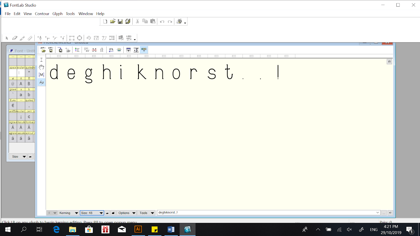
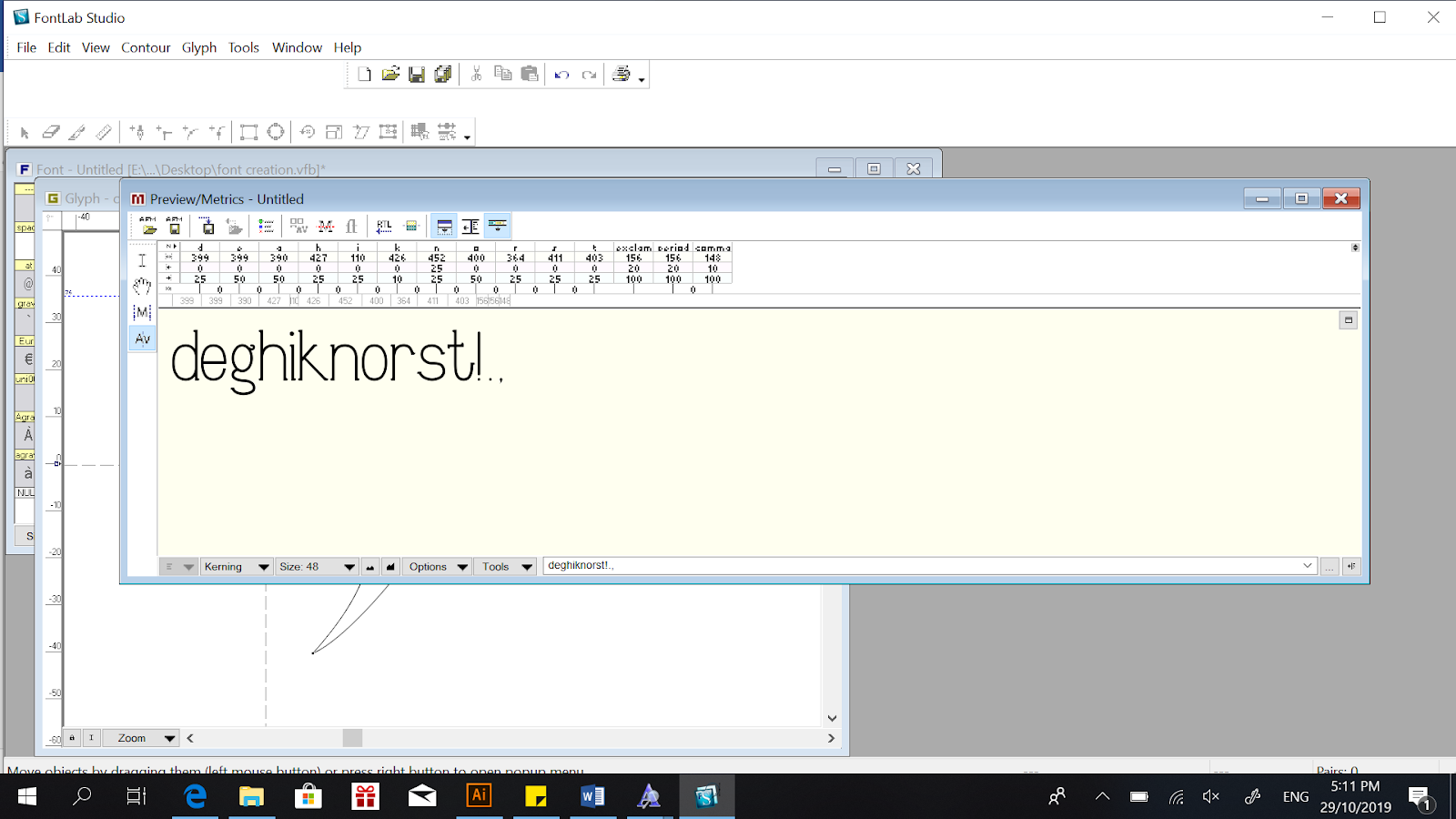
After asking my classmates for guidance, I started by moving my letters into FontLab. I adjusted the Metrix and Dimensions to Ascender : 700, Cap Height : 675, Descender : -200. For all the letters, I aligned them to the left axis.
After adding all the letters and characters, I opened the Metrix Window and typed out all the characters that I had illustrated. For kerning, I remembered that Mr Vinod wanted us to have our left column at 0. For the right, I tried to adjust until I find it neat.
This is what I ended up with after kerning.
My classmates told me that we were supposed to spell out "God is in the kerning" using the letters we created so I just did as I was told.
In the end, I saved the file in TrueType (*.ttf) format to generate it as a typeface. I then moved on into Illustration and typed out all the letters in one row and also the sentence "god is in the kerning". Below is my outcome.
Week 10 (30/10/19)
In class, Mr Vinod told us that our naming of font should be in 7pt and the typeface used should be Helvetica. It doesn't really matter how we aligned the sentence. Therefore, I adjusted my layout accordingly but I didn't change the alignment of it.
After receiving my feedback, Mr Vinod pointed out some mistakes that my characters had and he suggested that I edit it. I decide to work on my letters again.
I resketched the letters "g", "s", "t", "k", and "r" after the feedback and regenerate the font. I then went on to illustrator again for the final outlook. Below is the files for my final submission.
FEEDBACK
Week 7 (09/10/19)
General Feedback :
Mr Vinod said that we should include brief explanations about the images we included in the caption so the viewers can understand what's the purpose of us inserting the image. Even so, we should still elaborate after adding a caption to the image.
Specific Feedback :
Mr Shamsul commented that my processes should use JPEG. Only the final submission needs a JPEG and PDF. He also commented that I should increase the spacing between the image and text. I also have to remove the line after instruction as project 1 shouldn't be treated as instruction, it's under instruction.
Week 8 (16/10/19)
General Feedback : Mr Vinod wants us to update our blog continuously.
Specific Feedback :
Mr Vinod wanted me to refer to serifa light for the letter "d". He also mentioned that the letter "r" should have a shorter width.
Week 9 (23/10/19)
Absent
Week 10 (30/10/19)
General Feedback :
The way we layout of text does not have to all be the same. Also, our naming of the typeface should be 7pt and using the typeface Helvetica.
Specific Feedback :
Mr Vinod and Mr Shamsul commented that my font is interesting but some of the strokes weren't as consistent as it could be. For example, the letters "t", "k", and "r" extended a bit too much. The loop and link for the letter "g" can be worked on since it's a bit distorted. "s" is also quite unstable. However, the letters "o", "d", "e", and "i" are nice.
REFLECTION
EXPERIENCE
Week 7 (09/10/19); I was really lost while doing this project. After every sketch, I notice a problem in it and I had to keep editing it or redoing it. I feel like this is the hardest assignment we have received since the beginning. Week 8 (16/10/19); I found it easier to illustrate the font after awhile because I finally understood how I could draw the strokes neatly. Week 9 (23/10/19); I was sick this week so I didn't go to class. Luckily I asked my classmates for help! They taught me how to use FontLab and I also did a bit of research online. Too bad I couldn't go to class so I couldn't receive any feedback in class. Week 10 (30/10/19); I'm happy that I got back into class and received feedback :) which I really needed to help me improve. I wasn't as lost and stressed as last week maybe because I've improved in using Adobe Illustrator and also FontLab when compared to the previous week
OBSERVATION
Week 7 (09/10/19)
I notice that a lot of my mistakes were because I didn't pay attention to a lot of details. I was really lost even in class because of how much mistakes I made while sketching and also how much more details I had to take note on. Week 8 (16/10/19); I notice that letters like "k" and "s" were a bit hard for me to illustrate because of the serifs. I couldn't reuse the serifs that I used for the other letters so I had to adjust them one by one. However, I still tried to maintain or keep the curves as similar as possible so the letters won't vary too much. Week 9 (23/10/19); Because I didn't go to class, I went to look at other classmate's blog so I can have an idea on what I'm supposed to do and what files I'm supposed to save and insert in my blog. I notice that it was very useful although it might be a bit rude to just look at people's blog without their permission! sorry :( Week 10 (30/10/19); I noticed that it was easier for me to redo my illustration because I've finally got the hang of how to illustrate them properly. I could edit it faster than before.
FINDINGS
Week 7 (09/10/19); I find that I really have to refer to my notes while creating the letters. It would really help me more because I'm too forgetful and I tend to leave out some details when I'm sketching. Week 8 (16/10/19); I find that repeating the shapes while creating a new letter is definitely neater and easier to maintain a consistency. Week 9 (23/10/19), I find that going to class is definitely a better option. I was very unsure for the whole week, not knowing if the design is okay and if I'm doing the right thing. Hopefully I can recover as soon as possible and not skip any classes anymore!!! Week 10 (30/10/19); I find that Mr Vinod's advice is really helpful! I could feel that some of the letters were a bit off but I didn't really know where I can improve on or how to make it look better. Mr Vinod can spot the mistakes easily and tell me what changes I can make, which shows that experience is really important.
FURTHER READING
TYPE MATTERS by Jim Williams
09/10/19 - 23/10/19 (Week 7 - Week 9)
In this book, the author mentioned about emotional type. Words can be powerful if they are able to spring out our emotions. Sometimes, it might affect our emotions and our decisions. For example, words might make us buy products because we sense a connection to them. This is called utilizing the font's connotation. Connotation is the idea or feeling the typography invokes in a person. Choosing the correct font can help express the word/meaning of the phrase appropriately, helping readers to idealize the words without actually understanding it entirely.
Understanding the design objective of the client is crucial. For example, if it's a brochure for a high-end company, the typeface should be professional and legible. If it's a flyer for an event, it should be exciting and sparks interest. If it's for children, the typeface used can be more playful and interactive. We cannot assume that one typeface is able to serve every purpose.
Kerning is very important as consistent spacing between letters is more comfortable for the eyes to read. However, there are certain letters that do not fit well together. Some letters may look too close or far from each other eventhough there isn't a problem with kerning when they are aligned with other letters. This is why there can be manual adjustments of space between two letters. A properly designed font will have kerning pairs incorporated to eliminate suboptimal letter spacing. Kerning sets are sets of two letters whose spacing has been modified from the normal pre-set space to reflect a better visual relationship. The goal of kerning manually is to make sure the visual space between letters are uniform.
Ligatures are two or more letters that touch. The most frequently occurring ligature combinations are "fi", "fl", "ffi", and "ffl". These letters create awkward space when appearing next to each other. In this case, some typefaces chose to remove the dot of the letter "i" and have the ball terminal of "f" intefere with the letter "i".
Smart fonts are used to create "smart" fonts. These fonts have the ability to change with words as they are typed to create intricate interlock characters. The appearances changes automatically as the work is typed. The font has over 1,400 different sets of ligatures so that the letters will always fit to each other no matter the combination.
EXPLORING TYPOGRAPHY by Tova Rabinowitz
30/10/19 (Week 10)
The chapter that I mainly read was about designing a type, which was relevant to our current project. The main things the author covered was about :
1. Keeping a log

09/10/19 - 30/10/19 (Week 7 - Week 10)
Chan Jing Wen (0340480)
Typography
Project 2
LECTURE NOTES
LECTURE 7 : Describing letterform and typeface, Briefing on Project 2
09/10/19 (Week 7)
Below are some terms used to describe letterform :
Baseline : The imaginary line the visual base of the letterforms.
Median : The imaginary line defining the x-height of letterforms.
X-height : The height in any typeface of the lowercase 'x'.
Cap height : The height of a capital letter above the baseline.
Ascender height : The height of an ascender (the upward stem of a lowercase letter) above the baseline.
* Ascender must exceed the cap height slightly, almost unnoticeably because an uppercase letter tends to look bigger than a lowercase letter. It has to exceed so aesthetic balance is achieved.
Descender height :The height of a descender (the downward stem of a lowercase letter) below the baseline.
 |
| Figure 1.1 Baseline, Median, X-height, Cap height, Ascender height, Descender height |
Stroke : Any line that defines the basic letterform.
 |
| Figure 1.2 Stroke |
Apex/Vertex : The point created by joining two diagonal stems.
 |
| Figure 1.3 Apex |
 |
| Figure 1.4 Vertex |
Arm : Short strokes off the stem of the letterform, either horizontal or vertical.
 |
| Figure 1.5 Arm |
Ascender : The portion of the stem of a lowercase letter that projects above the median.
 |
| Figure 1.6 Ascender |
Barb : The half-serif finish on some curved stroke.
 |
| Figure 1.7 Barb |
Beak : The half-serif finish on some horizontal arms.
Bowl : The rounded form that describes a counter. The bowl may be either open or close.
 |
| Figure 1.9 Bowl |
Bracket : The transition between the serif and the stem.
Cross Bar : The horizontal stroke in a letterform that joins two stems together.
 |
| Figure 1.11 Cross Bar |
Cross Stroke : The horizontal stroke across the stem of a lowercase.
 |
| Figure 1.12 Cross Stroke |
Crotch : The interior space where two strokes meet.
 |
| Figure 1.13 Crotch |
Descender : The portion of the stem of a lowercase letter that projects below the baseline.
 |
| Figure 1.14 Descender |
Ear : The stroke extending out from the main stem or body of the letterform.
 |
| Figure 1.15 Ear |
Em space : The size of the typeface. (Refers to the width of the letter "M", the biggest letter.)
Em dash, - : Used when you have a sentence between a sentence.
En space : Half the width of an Em. (refers to the width of the letter "N", half the size of the letter "M".)
En dash : Used when we want to replace the word "to", eg : 1997-2000.
Hyphen, - : When there's a word break, to join two words, eg : half-serif.
Finial : The rounded non-serif terminal to a stroke.
 |
| Figure 1.16 Finial |
Leg : Short stroke off the stem of the letterform, either at the bottom of the stroke or inclined downward.
 |
| Figure 1.17 Leg |
Ligature : The character formed by the combination of two letterform.
 |
| Figure 1.18 Ligature |
Link : The stroke that connects the bowl and the loop of a lowercase "g".
 |
| Figure 1.19 Link |
Loop : In some typeface, the bowl creates the descender of a lowercase "g".
 |
| Figure 1.20 Loop |
Serif : The right-angled or oblique foot at the end of the stroke.
 |
| Figure 1.21 Serif |
Shoulder : The curved stroke that is not part of a bowl.
 |
| Figure 1.22 Shoulder |
Spine : The curved stem of a "S".
 |
| Figure 1.23 Spine |
Spur : The extension that articulates the junction of the curved and rectilinear stroke.
 |
| Figure 1.24 Spur |
Stem : The significant vertical or oblique stroke.
 |
| Figure 1.25 Stem |
Stress : The orientation of the letterform, indicated by the thin stroke in round form.
 |
| Figure 1.26 Stress |
Swash : The flourish that extends the stroke of the letterform.
 |
| Figure 1.27 Swash |
Tail : The curved diagonal stroke at the finish of certain letterform.
 |
| Figure 1.28 Tail |
Terminal : The self-contained finish of a stroke without a serif. Terminals may be flat, flared, acute, grave, concave, convex, or rounded as a ball or a teardrop (like finial).
 |
| Figure 1.29 Terminal |
Below are some basic terms used to describe fonts :
Uppercase : Capital letters.
Lowercase : Lowercase letters include the same characters as uppercase.
* Uppercase and Lowercase letters are named as it is due to uppercase letters being stored in the upper case and lower case letters being stored in the lower case.
Small Capitals : Uppercase letterforms draw to the x-height of the typeface. Small Caps are primarily found in serif fonts as part of what is often called expert set.
* Most type software includes a style command that generates a small cap based on uppercase forms. Do not confuse real small caps with those artificially generated.
Uppercase Numerals : (aka lining figure) These numerals are the same height as uppercase letters and are all set to the same kerning width.
Lowercase Numerals : (aka non-aligned numerals, old style figure, text figure) These numerals are set to x-height with ascenders and descenders. They are best used when ever you would use upper and lowercase letterforms.
Punctuation, miscellaneous character : Although all fonts contain standard punctuation marks, miscellaneous characters can change from typeface to typeface.
Ornaments : Used as flourishes in certificates or invitations. They are usually provided as a font in a larger typeface family.
Below are the terms used in describing typefaces :
 |
| Figure 1.30 Terms to describe typeface |
Roman : The letterform is so called because the uppercase forms are derived from inscriptions of Roman monuments. A slightly lighter stroke in roman is known as "Book".
Book : It is meant for typesetting a large amount of text as some roman fonts are too thick to read.
Italic : Most fonts today are produced with a matching italic. It mimics the hand writing of Italians in the fifteenth century.
* Italics was originally a type family itself
Oblique : It is based on Roman form of typeface but slightly slanted to give a Italic effect. It does not follow the writing culture, same as san serif.
Boldface : Thicker stroke variation of Roman. Types are "semibold", "medium", "black", "extra bold", "superbold" and even "poster".
Light : Lighter stroke of Roman. An even lighter stroke would be "thin".
Condense : A version of Roman which is extremely condensed. Can also be known as "compressed".
Extended : An extended version of Roman.
*Typeface reflects the time period.
* & was actually the 27th letter.
LECTURE 8 : Letters
16/09/19 (Week 8)
Some uppercase letters (eg : "A") look symmetrical but if you dissect it, you can see that it's not. For serifs, there are different arcs for each of them. The strokes might also have different width. This is because these little details are what makes the letters harmonious.
X-height generally describes the height of lowercase letters. However, curved strokes such as in "s" must rise above the median or sink below the baseline in order for them to seem aligned with the other letters.
When letters are joined to form words, the counterform includes the space between them. Counter is the negative space between letters. There must be a balance between form and counter so the words are easy to read.
LECTURE 9
23/09/19 (Week 9)
I was absent for this lecture but I asked my classmates for updates. They said that there was no lecture and that Mr Vinod just had them continue on Project 2.
LECTURE 10
30/10/19 (Week 10)
There was also no lecture this week. Mr Vinod and Mr Shamsul went around class to check on our Project 2. After that was the introduction of the first part of our Final Project.
INSTRUCTIONS
PROJECT 2
Week 7 (09/10/19)
We were given the letters and punctuations : "d", "g", "i", "s", "n", "o", "e", "h", "t", "k", "r", "!", "." and ",".
For this project, we have to create a typeface based on the typeface we selected. I chose ITC New Baskerville Regular.
For our first step, we were told to dissect 5 of the letters from the typeface we chose. I chose to dissect the letters "h", "i", "d", "e" and "s".
Below are the letters dissected :
 |
| Figure 2.1 Dissection of lowercase 'H' |
 |
| Figure 2.2 Dissection of lowercase "I" |
 |
| Figure 2.3 Dissection of lowercase "D" |
 |
| Figure 2.4 Dissection of lowercase "E" |
 |
| Figure 2.5 Dissection of lowercase "S" |
After dissecting, I understood more on how this typeface is. My understanding was that all the curves aren't composed by just one circle. The serifs for "H" and "I" aren't actually straight.
I went on to sketch my typeface. My idea was that I wanted my letters to be composed by basic circles. I didn't want my serifs to be straight but in stead of having it curve inwards I did it outwards. I also wanted to keep the thickness even.
I started by sketching the letters on my sketchbook. I realize that it was too hard for me to figure the sizing of the letters and everything so I redid it on graph paper.
 |
| Figure 2.6 Sketch of letters 01 |
I started by sketching ovals. I tried to keep all the width of the ovals the same. For letters like "G" and "S", I had to decrease the size of the ovals but I tried to keep the dimensions as equal as possible.
 |
| Figure 2.7 Sketch of letters 02 |
 |
| Figure 2.8 Sketch of letters 03 |
As above, I changed the design of "T", "S", "N", "E" and "H".
 |
| Figure 2.9 First Attempt in Illustrating the letters |
After sketching, I initially wanted to do my illustration straight away. However, while I was illustrating, I noticed a problem here. My artboard could not fit my ascender and descender. I wasn't really sure if it was okay because I remember that Mr Vinod mentioned how a good typeface will usually not have a long ascender and descender so I decided to re-sketch my letters with a smaller ascender and descender. However, I still illustrated "i", "r", and "s" since they aren't affected too much by the ascender and descender height.
 |
| Figure 2.10 Sketch of letters 04 |
This time, I only selected a few letters since I wanted the same concept but wanted to check if a smaller descender and ascender would be fine. I also played with the width of the letter, but I feel like the top one is better.
 |
| Figure 2.11 Sketch of letters 05 |
However, I felt that my idea was really simple and I wasn't sure if I liked it so I sketched another one. For this attempt, I tried drawing the serifs round and making it thicker.
 |
| Figure 2.12 Second Attempt in Illustration |
As I was illustrating, I notice a really big bug in my typeface. My letters all had the same width! I don't know why I forgot that not all letters have the same width and why I thought it'd be cool. I think I'll just make the changes in illustrator. While illustrating the letters, I also changed the serif a bit.
Week 8 (16/10/19)
After receiving feedback, Mr Vinod told me what I could reference from to help my creation. I noticed that I forgot to show him my other draft once he left. :/ I think I'll just move on with the one he saw since he didn't really say anything bad about it except for some changes and things I should take notes on. However, I'll also sketch my other idea if I have time just for backup.
 |
| Figure 3.1 Third Attempt in Illustration |
This was my third attempt in illustrating. I feel like the shapes are really weird because the circles aren't really nicely drawn. At the end of the class, Mr Vinod showed us how to use FontLab and how to change the strokes into selecting the outline of the strokes. At that point I noticed my mistakes :) so I know what to work on once I get home.
I noticed that my mistake was that I tried sketching the outline. Instead, I could have just drew one line and then adjust the stroke width so the whole stroke would be consistent in width. In the end, I just have to outline the stroke and it'll outline the entire thing so it's not just a path. I used this method to re-illustrate all the letters.
 |
| Figure 3.2 Forth Attempt in Illustration, creating the strokes |
I noticed that my mistake was that I tried sketching the outline. Instead, I could have just drew one line and then adjust the stroke width so the whole stroke would be consistent in width. In the end, I just have to outline the stroke and it'll outline the entire thing so it's not just a path. I used this method to re-illustrate all the letters.
 |
| Figure 3.3 Forth Attempt in Illustration, grouping the strokes into one entire letter |
Mr Vinod told us that our letter should only be one stroke instead of different paths. Therefore, I copy and paste all the letters to another artboard and grouped the strokes for the copied version so I wouldn't lose the original one with all the different parts.
| Figure 3.4 Outcome of the illustrated letters |
 |
| Figure 3.5 Final Outcome of the illustrated characters |
These are the illustrations for the letters and characters.
Week 9 (23/10/19)
I was absent for this week's class. I asked my friends for help because I didn't know how to use FontLab.
 |
| Figure 4.1 Copy and pasting the illustrated letters into FontLab |
After asking my classmates for guidance, I started by moving my letters into FontLab. I adjusted the Metrix and Dimensions to Ascender : 700, Cap Height : 675, Descender : -200. For all the letters, I aligned them to the left axis.
 |
| Figure 4.2 Characters in Metrix Window before kerning |
After adding all the letters and characters, I opened the Metrix Window and typed out all the characters that I had illustrated. For kerning, I remembered that Mr Vinod wanted us to have our left column at 0. For the right, I tried to adjust until I find it neat.
 |
| Figure 4.3 Characters in Metrix Window after kerning |
This is what I ended up with after kerning.
 |
| Figure 4.4 "God is in the kerning!,." |
In the end, I saved the file in TrueType (*.ttf) format to generate it as a typeface. I then moved on into Illustration and typed out all the letters in one row and also the sentence "god is in the kerning". Below is my outcome.
 |
| Figure 4.5 Characters arranged on a baseline |
 |
| Figure 4.6 Trial 01 for A4 Layout |
Week 10 (30/10/19)
In class, Mr Vinod told us that our naming of font should be in 7pt and the typeface used should be Helvetica. It doesn't really matter how we aligned the sentence. Therefore, I adjusted my layout accordingly but I didn't change the alignment of it.
 |
| Figure 5.1 Trial 02 for A4 Layout |
After receiving my feedback, Mr Vinod pointed out some mistakes that my characters had and he suggested that I edit it. I decide to work on my letters again.
 |
| Figure 5.2 Before and after resketching of letters "g", "s", "t", "k", and "r" |
 |
| Figure 5.3 "God is in the kerning" after resketch |
 |
| Figure 5.4 Characters in Metrix Window after resketching |
I resketched the letters "g", "s", "t", "k", and "r" after the feedback and regenerate the font. I then went on to illustrator again for the final outlook. Below is the files for my final submission.
 |
| Figure 5.5 Final Characters arranged on a baseline |
 |
| Figure 5.6 Final Submission for A4 Layout (JPEG) |
Figure 5.7 Final Submission for A4 Layout (PDF)
FEEDBACK
Week 7 (09/10/19)
General Feedback :
Mr Vinod said that we should include brief explanations about the images we included in the caption so the viewers can understand what's the purpose of us inserting the image. Even so, we should still elaborate after adding a caption to the image.
Specific Feedback :
Mr Shamsul commented that my processes should use JPEG. Only the final submission needs a JPEG and PDF. He also commented that I should increase the spacing between the image and text. I also have to remove the line after instruction as project 1 shouldn't be treated as instruction, it's under instruction.
Week 8 (16/10/19)
General Feedback : Mr Vinod wants us to update our blog continuously.
Specific Feedback :
Mr Vinod wanted me to refer to serifa light for the letter "d". He also mentioned that the letter "r" should have a shorter width.
Week 9 (23/10/19)
Absent
Week 10 (30/10/19)
General Feedback :
The way we layout of text does not have to all be the same. Also, our naming of the typeface should be 7pt and using the typeface Helvetica.
Specific Feedback :
Mr Vinod and Mr Shamsul commented that my font is interesting but some of the strokes weren't as consistent as it could be. For example, the letters "t", "k", and "r" extended a bit too much. The loop and link for the letter "g" can be worked on since it's a bit distorted. "s" is also quite unstable. However, the letters "o", "d", "e", and "i" are nice.
REFLECTION
EXPERIENCE
Week 7 (09/10/19); I was really lost while doing this project. After every sketch, I notice a problem in it and I had to keep editing it or redoing it. I feel like this is the hardest assignment we have received since the beginning. Week 8 (16/10/19); I found it easier to illustrate the font after awhile because I finally understood how I could draw the strokes neatly. Week 9 (23/10/19); I was sick this week so I didn't go to class. Luckily I asked my classmates for help! They taught me how to use FontLab and I also did a bit of research online. Too bad I couldn't go to class so I couldn't receive any feedback in class. Week 10 (30/10/19); I'm happy that I got back into class and received feedback :) which I really needed to help me improve. I wasn't as lost and stressed as last week maybe because I've improved in using Adobe Illustrator and also FontLab when compared to the previous week
OBSERVATION
Week 7 (09/10/19)
I notice that a lot of my mistakes were because I didn't pay attention to a lot of details. I was really lost even in class because of how much mistakes I made while sketching and also how much more details I had to take note on. Week 8 (16/10/19); I notice that letters like "k" and "s" were a bit hard for me to illustrate because of the serifs. I couldn't reuse the serifs that I used for the other letters so I had to adjust them one by one. However, I still tried to maintain or keep the curves as similar as possible so the letters won't vary too much. Week 9 (23/10/19); Because I didn't go to class, I went to look at other classmate's blog so I can have an idea on what I'm supposed to do and what files I'm supposed to save and insert in my blog. I notice that it was very useful although it might be a bit rude to just look at people's blog without their permission! sorry :( Week 10 (30/10/19); I noticed that it was easier for me to redo my illustration because I've finally got the hang of how to illustrate them properly. I could edit it faster than before.
FINDINGS
Week 7 (09/10/19); I find that I really have to refer to my notes while creating the letters. It would really help me more because I'm too forgetful and I tend to leave out some details when I'm sketching. Week 8 (16/10/19); I find that repeating the shapes while creating a new letter is definitely neater and easier to maintain a consistency. Week 9 (23/10/19), I find that going to class is definitely a better option. I was very unsure for the whole week, not knowing if the design is okay and if I'm doing the right thing. Hopefully I can recover as soon as possible and not skip any classes anymore!!! Week 10 (30/10/19); I find that Mr Vinod's advice is really helpful! I could feel that some of the letters were a bit off but I didn't really know where I can improve on or how to make it look better. Mr Vinod can spot the mistakes easily and tell me what changes I can make, which shows that experience is really important.
FURTHER READING
TYPE MATTERS by Jim Williams
09/10/19 - 23/10/19 (Week 7 - Week 9)
 |
| Figure 5.1 Type Matters |
In this book, the author mentioned about emotional type. Words can be powerful if they are able to spring out our emotions. Sometimes, it might affect our emotions and our decisions. For example, words might make us buy products because we sense a connection to them. This is called utilizing the font's connotation. Connotation is the idea or feeling the typography invokes in a person. Choosing the correct font can help express the word/meaning of the phrase appropriately, helping readers to idealize the words without actually understanding it entirely.
Understanding the design objective of the client is crucial. For example, if it's a brochure for a high-end company, the typeface should be professional and legible. If it's a flyer for an event, it should be exciting and sparks interest. If it's for children, the typeface used can be more playful and interactive. We cannot assume that one typeface is able to serve every purpose.
Kerning is very important as consistent spacing between letters is more comfortable for the eyes to read. However, there are certain letters that do not fit well together. Some letters may look too close or far from each other eventhough there isn't a problem with kerning when they are aligned with other letters. This is why there can be manual adjustments of space between two letters. A properly designed font will have kerning pairs incorporated to eliminate suboptimal letter spacing. Kerning sets are sets of two letters whose spacing has been modified from the normal pre-set space to reflect a better visual relationship. The goal of kerning manually is to make sure the visual space between letters are uniform.
Ligatures are two or more letters that touch. The most frequently occurring ligature combinations are "fi", "fl", "ffi", and "ffl". These letters create awkward space when appearing next to each other. In this case, some typefaces chose to remove the dot of the letter "i" and have the ball terminal of "f" intefere with the letter "i".
Smart fonts are used to create "smart" fonts. These fonts have the ability to change with words as they are typed to create intricate interlock characters. The appearances changes automatically as the work is typed. The font has over 1,400 different sets of ligatures so that the letters will always fit to each other no matter the combination.
EXPLORING TYPOGRAPHY by Tova Rabinowitz
30/10/19 (Week 10)
 |
| Figure 5.2 Exploring Typography |
The chapter that I mainly read was about designing a type, which was relevant to our current project. The main things the author covered was about :
1. Keeping a log
- Keeping a notebook around you at all times is essential because there's a lot of details that we want to keep track of but we can't just rely on our own memory.
- Before starting a design, you must review and study as many typefaces as possible.
- This is for us to refresh what's already been placed out. It is also easier for us to compare typeface with similar purpose (especially to the one that we are creating).
- It also helps you identify mistakes from other typefaces and what you can improve on.
- It is better if we refer to a printed collection of fonts instead of reviewing the fonts online because of the computer's resolution.
- Collect and record typefaces that you find interesting in a scrapbook.
- When we design letters, we should focus more on the upper halves and right side of the English alphabet because it's the crucial part to how we recognize letters.
- Guides help designers make sure that their type is consistent in size.
- Usually, the creation of the capital letter "M" is the most crucial part as it indicates the em-space. No other letter should be bigger than the capital letter "M".
- Em square : an imaginary bounding box that is used to size and align glyphs. The size of an em square is always the same as the typface's point size. It must accommodate each character in full. It must also contain some extra space on the sides and top of the glyph so other characters won't bump into each other. The em space is divided into ascent and descent.
- The baseline divides the em space at about 20% up from the bottom, leaving 80% for the ascent.
- Cap height is generally 75% to 85% of the height of the ascent starting from the baseline.
- The x-height is usually sized around 50% to 80% of the cap height. Note : If the x-height is too short, legibility will decrease.
- The ascender line should be either the same height as the cap height or slightly taller.
- The descender can be the full descent size.
- Contrast in typography refers to the variance between the thick and thin letter parts.
- Low contrast may appear dull, high contrast may distort the letter too much. Both will cause the legibility of the typeface to decrease.
- Vertical capital stem stroke : 13% to 18% of the cap height
- Vertical capital hairline stroke : 5% to 8% of the cap height
- Vertical lowercase stem stroke : 80% to 90% of the vertical capital stem stroke
- Vertical lowercase hairline stroke : 70% to 80% of the capital hairline stroke
- Crossbars are often thicker
- The consistent distribution of thick and thin letter parts help add grace and distinctiveness to fonts.
- A typical font usually has an angle of stress between 60 to 90 degrees.
- Serif or san serif
- Terminal shape and size might vary for each letter.
- For serif fonts, you need to determine the shape and size of both uppercase and lowercase serifs.
- You will also need to decide on the slope and height of the brackets from the stem.
- Elements from stems, crossbars, terminals, shoulders must all be put into consideration when creating a typeface.
- Start by adding shapes using the shape tool (in computer) and then add, subtract and manipulate points and curves to mold the shape into a glyph.
- Use pen, pencil, or even brush tool to draw the glyph as a combination of strokes.
- Then, assign the desired stroke weight and convert the stroke into shapes.
- Use as few points as possible to draw your glyph.
- Handles should not cross each other.
- Points should be placed parallel to the axes while creating curves.
- Handle of a point along a smooth curve should be straight across from each other at a 180 degree angle
- At a point where a curve becomes straight, the handles should project straight out in the same direction as the straight line. It should not go beyond the curve.


Comments
Post a Comment