TYPOGRAPHY - EXERCISE
TYPOGRAPHY - EXERCISES

28/08/19 - 18/09/19 (Week 1 - Week 4)
Chan Jing Wen (0340480)
Typography
Exercises
LECTURE NOTES
Lecture 1: Briefing
28/08/19 (Week 1)
Today was the first day of class. We started off by learning how to create our own blogs to journal our whole design journey. This is actually my first time using Blogger so it was useful that our lecturers, Mr Vinod and Mr Shamsul, taught us how to use it.
After that, we followed by introducing ourselves to our lecturers and classmates. We then moved on to the official introduction for Typography. From the lecture, I understand how typography is how we design words to express. I also finally understand (or maybe briefly understand) that there's a difference between fonts, typeface and type family.
Based on my undestanding, these are the lose meaning of the terms :
Font : the term used during the creating process.
Type family : a range of typeface designs that are variations of one basic style of alphabet. (eg : Arial)
(Definition from https://www.fonts.com/content/learning/fontology/level-1/type-families)
Typeface : the individual design in a type family. (eg : Arial bold)
Our lecturer recommended us to read more about typography by ourselves and also read about some typographers.
Lecture 2 : History of Typography, How to animate
04/09/19 (Week 2)
We started the class by having Mr Vinod giving a lecture about the history of typography. He did mention that the history that he would be teaching about is quite brief and is slightly bias to the western culture. He discussed about how typography changed based on the tools that were used and what was needed. He also mentioned how people would prioritize economics and efficiency over beauty. An example of this is that people would squeeze their writing because it would allow them to write more on a medium although it doesn't look appealing. He suggested that we study more about the history during our free time.
After the lecture, Mr Vinod and Mr Shamsul checked our lettering and we moved on with the animation. Mr Shamsul taught us how to use some specific tools in Adobe Illustrator that would be helpful for our animation. He also taught us how to animate it in Adobe Photoshop.
Lecture 3 : Text and Tracking, Texture, Formatting, Leading and Line Length
11/09/19 (Week 3)
At the beginning of class, Mr Vinod and Mr Shamsul went around to check our animations and give feedback. After that, they gave us advice on managing the blog. There are now a few blogs posted in the Facebook page as reference.
After that, we learned a lot of definition for different terms.
Types of Alignment
2. Centered : It gives symmetry upon the text, assign equal weight and value to both ends of the line
- it's not advisable to use this for large amount of text
3. Flush Right : Each line ends at the same point, therefore the starting points aren't aligned
- also not advisable to use for large amount of text since starting point isn't aligned
4. Justified : I also gives symmetry upon the text but there's an increase and decrease of spacing in between the letters and words that makes the start and end of the line to align to all of the other starting and ending points.
Different typeface have different colour (gray scale).
A good paragraph/sentence should take note on these few things :
Lecture 4 : Indicating Paragraphs, Widow and Orphan, Highlight Text, Headline, Cross Alignment
18/09/19 (Week 4)
There are a few ways to indicate a paragraph
Extended paragraphs
There are 2 unpardonable gaffes in typesetting.
One way to adjust to make widows less obvious is by rebreaking the line endings. Orphans are much more harder to deal with.
To highlight text, there are a few ways to do it.
Headline within text can be express by
The way we write our headlines will also show how important the headlines are. If it shows a significant break between two paragraphs, it's a very important headline; if it's not separated from the body of text, it is less important but still highlighted from the rest of the text.
Cross Alignment - when you have a line of text in one column and another, you have to standardize the leading.
INSTRUCTIONS
EXERCISES
Lettering (Week 1 - Week 2)
Week 1 (28/08/19)
Our first assignment was to design 5 types of lettering based on one of our personalities. Mr Vinod said that it would be better if we chose a personality that represents ourselves which is able to be expressed through lettering.
I actually decided the personality that I would like to express quite fast. The characteristic that I will be using is "lost". I'm a person that is always lost. I'm not good with directions, easily get lost in my own world when I'm doing things and don't really know what decisions to make. With this in mind, I jot down a few ideas I had in mind in class. I drew it onto my sketchbook and record how I could animate the letters in the future to be prepared for the next lecture.
I then transfer them onto graph paper.
Week 2 (04/09/19)
Continuing last week, we had to animate the selected lettering. Before animating, we have to let Mr Vinod and Mr Shamsul check our work. They both helped us decide which lettering we could use.
After showing them my sketches, they pointed out that I should go with the shadow idea (which I was quite surprise). However, they wanted me to change the lettering. So, before animating anything I redraw the lettering and have them check it again.
After checking, I then proceed to animating the lettering. We received a lot of help from Mr Shamsul as he told us what tools we could use and how we were supposed to make it into an animation.
Below is the still image and animation of the lettering "Lost" :
On Monday (09/09/19), Mr Vinod updated the Facebook page with details of the next exercise - Type Expression.
Type Expression (Week 3 - Week 4)
Week 3 (11/09/19)
For this week, we have to do type expressions. The words given are CLEAN, GIGANTIC, PARTY, EXPLODE, EMERGE, SNEEZE. Mr Vinod also provided us some type families to use while expressing the words.
I sketched down my ideas on a piece of paper.
After having it checked, I proceed to illustrating it. I made a few minor changes to my type expression and expressed "PARTY" in a different way.
For the animation, I chose to animate the type expression for "EXPLODE".
FEEDBACK
Week 2 (04/09/19)
After showing the drafts, both Mr Vinod and Mr Shamsul were quick to agree on one of the designs (which was the shadow design). However, they suggested that I should change the lettering but keep the idea. After I presented another lettering, they said that it was fine and that I should just continue on to the animating process.
Week 3 (11/09/19)
Specific Feedback :
(Animation)
Mr Vinod and Mr Shamsul said that the animation was okay. They mostly gave feedback on my blog saying that the pictures taken were neat and that I should add my characteristic in the caption of the photo. They also wanted me to add FINDINGS under reflections and update my blog with the animation and still image.
(Type expression)
For the words CLEAN and PARTY, Mr Vinod and Mr Shamsul think that I rely too much on illustration. They said that for CLEAN, I should try replacing the wiper with a gradient. They liked/was ok with GIGANTIC, EXPLODE and EMERGE. For SNEEZE, they suggested that the "NEEZE" can be placed below the nose. Overall they commented that I should try to make the alignments different instead of having it all in the center.
General Feedback :
Mr Vinod asked us to refer back to the reference he provided on Facebook.
Week 4 (18/09/19)
Specific Feedback :
Mr Vinod commented that the animation for explode was good. He liked that the letters were shaking before exploding and the smoke effect after "O" exploded.
General Feedback :
Mr Vinod wanted us to insert the actual photos in our blog instead of a screenshot. It should be in a PDF format. He also mentioned that we should record our whole process of making.
REFLECTION
Experience :
Week 1 (28/08/19); Before this I've never really touched typography. After trying to design myself while also looking at other people's design, I (genuinely) understand how important typography is. If the typography is good, the message can be conveyed and interpreted fluently. I feel like you wouldn't have to understand the language as long as the typography is design closely to what the message is trying to say. Hopefully I'll be able to learn more and improve. Week 2 (04/09/19); It was fun learning how to animate still drawings. When showing my letterings to Mr Vinod and Mr Shamsul, I actually thought that they would choose a different lettering. I guess this shows that different people really have different opinions. I was kind of bummed that they didn't choose the one that I was expecting but IT'S OKAY. I can work with it. :) Week 3 (11/09/19); I really liked importing the artboards into Photoshop and clicking every frame one by one. It's nice seeing all the artboards forming an animation! Week 4 (18/09/19); This week's experience was very different. We were told to move around the whole classroom to check out other people's work. My experience from this was that it was so cool how we just walked around looking at other people's artwork and thinking how they actually came up with their ideas.
Observation :
Week 1 (28/08/19); I notice how my classmates were struggling on what personality they should choose and how they should design it in order for it to send out the correct message. As for myself, I couldn't actually come out with 5 ideas that I'm totally happy with. However, I noticed that I should just try to draw something out (even if it doesn't seem relevant in the beginning) so that it gives me more inspiration and creates something else that is relevant. I think I should continue pushing myself to just do whatever I can and not be afraid that it might not turn out to be perfect because you never know what it'll lead you to. Week 2 (04/09/19); I notice how there were different students in the classroom. The students from foundation seem to know what they were doing, whereas students that didn't study art previously were taking down notes for every single thing the lecturers mentioned. Hopefully I can catch up with them! I also notice that it was quite hard to draw using the mouse pad so I'll definitely be using my mouse for further exercises. Week 3 (11/09/19); I saw that a lot of people used different ways to express the words given. A lot of them were very cool and it's very refreshing to see how everyone has different ideas. Week 4 (18/09/19); For this week, most of us were already done with animating and everything. Mr Vinod wanted us to walk around and see what everyone has done. I was quite amazed how a lot of people expressed GIGANTIC by highlighting "giant" in the word. I never noticed it before looking at other people's work. It was also interesting how there were a lot of different expressions done for "EXPLODE".
Findings :
Week 1 (28/08/19); I found that just drawing random things out is kind of useful. You never know what a random thought will lead you to. Also, I found that it's better if I update my blog as early as possible so I don't forget about it. Week 2 (04/09/19); I found that I usually think things to complex. I'm always worried that the final product isn't enough and add things that might not be necessary for the work. I feel like I really have to calm down and be a little bit more confident in keeping things more simple. Week 3 (11/09/19); I found that some words are actually easier to express than others. For me, I think adjectives are easier to express than nouns and verbs. I can think of possible animations and elements to include easily. I found it rather challenging to create a type expression for "PARTY". Week 4 (18/09/19); I found that walking around and looking at people's work is really cool and helpful. It makes me wonder how people think of their ideas and how much more I can improve.
FURTHER READING
A Typographic Workbook by Kate Clair and Cynthia Busic-Snyder
28/08/19 - 04/09/19 (Week 1 - Week 2)
This book really focuses on the history of Typography. It starts of with the Ancient Writing System. In ancient times, a writing system was essential. Before written communication was used, it was really hard to record history. At the beginning, people would use things or drawings to represent and record history, but as time goes by, people might forget the initial details that were meant to be recorded or forget why they even recorded such things in the beginning.
There were a few types of writing systems back in the past. There was cuneiform, hieroglyphics, precursors, Sanskrit. These writing system help them record laws, history, scientific discoveries, medicine, mathematics, literature, philosophy, and religious practice. If it wasn't because of the writing system, we might not be able to learn so much about the past right now.
Pictograph-Based Writing System is basically using a simplified drawing to represent an object. This is assumed as the first step in developing most written language. For example, mandarin characters today are actually pictograph-based after thousand years of evolution.
What Is Typography? by David Jury
11/09/19 - 18/09/19 (Week 3 - Week 4)
This book discusses about what typography is, the issues about it and also the anatomy of typography. The author also included a few portfolios of other typographers.
Based on the author, the arrangement of text on pages are taught at school from a very young age. This is because students are asked to leave the left margin clear so their teachers can leave comments. It also helps them keep their start of every line straight and aligned (which is actually flush left alignment). However, he feels that our education does not emphasis the importance of typography. Students are told to do so but they do not know why. This leads to them not understanding the importance of keeping their text readable and neat.
Besides that, he also commented about how the education system sees bad handwriting as a sign of "good" education. The education system only cares about the content and neglects the importance of the presentation of content. There are schools who teach typography, but they teach with a relaxed approach with no emphasis on craft and accuracy. They just tell the students what they're supposed to do/follow without telling them the reason behind it.
He also thinks that conventions are restraining our creativity. He does not deny the importance of conventions, but he feels that many people's creativity is questioned by conventions. He wants the new generation of typographers to understand that working within parameters should help make their typography good instead of restricting them from new ideas.
In the book, he also discussed about topics like grids, kerning, tracking, space between words and more. He records how we should use them to create better typography and the consequences of not managing them well.

28/08/19 - 18/09/19 (Week 1 - Week 4)
Chan Jing Wen (0340480)
Typography
Exercises
LECTURE NOTES
Lecture 1: Briefing
28/08/19 (Week 1)
Today was the first day of class. We started off by learning how to create our own blogs to journal our whole design journey. This is actually my first time using Blogger so it was useful that our lecturers, Mr Vinod and Mr Shamsul, taught us how to use it.
After that, we followed by introducing ourselves to our lecturers and classmates. We then moved on to the official introduction for Typography. From the lecture, I understand how typography is how we design words to express. I also finally understand (or maybe briefly understand) that there's a difference between fonts, typeface and type family.
Based on my undestanding, these are the lose meaning of the terms :
Font : the term used during the creating process.
Type family : a range of typeface designs that are variations of one basic style of alphabet. (eg : Arial)
(Definition from https://www.fonts.com/content/learning/fontology/level-1/type-families)
Typeface : the individual design in a type family. (eg : Arial bold)
Our lecturer recommended us to read more about typography by ourselves and also read about some typographers.
Lecture 2 : History of Typography, How to animate
04/09/19 (Week 2)
We started the class by having Mr Vinod giving a lecture about the history of typography. He did mention that the history that he would be teaching about is quite brief and is slightly bias to the western culture. He discussed about how typography changed based on the tools that were used and what was needed. He also mentioned how people would prioritize economics and efficiency over beauty. An example of this is that people would squeeze their writing because it would allow them to write more on a medium although it doesn't look appealing. He suggested that we study more about the history during our free time.
After the lecture, Mr Vinod and Mr Shamsul checked our lettering and we moved on with the animation. Mr Shamsul taught us how to use some specific tools in Adobe Illustrator that would be helpful for our animation. He also taught us how to animate it in Adobe Photoshop.
Lecture 3 : Text and Tracking, Texture, Formatting, Leading and Line Length
11/09/19 (Week 3)
At the beginning of class, Mr Vinod and Mr Shamsul went around to check our animations and give feedback. After that, they gave us advice on managing the blog. There are now a few blogs posted in the Facebook page as reference.
After that, we learned a lot of definition for different terms.
- LETTERSPACING : increasing space between the letters
- letterspacing is not really necessary as spacing between letters are already designated
- letterspacing is usually introduced when writing UPPERCASE so it's easier to read
- UPPERCASES are drawn to be able to stand alone
- KERNING : decreasing space between the letters
- TRACKING : when both decreasing and increasing occurs in between a word/sentence
Types of Alignment
2. Centered : It gives symmetry upon the text, assign equal weight and value to both ends of the line
- it's not advisable to use this for large amount of text
3. Flush Right : Each line ends at the same point, therefore the starting points aren't aligned
- also not advisable to use for large amount of text since starting point isn't aligned
4. Justified : I also gives symmetry upon the text but there's an increase and decrease of spacing in between the letters and words that makes the start and end of the line to align to all of the other starting and ending points.
Different typeface have different colour (gray scale).
A good paragraph/sentence should take note on these few things :
- Type Size : should be large enough to read at arms length
- Leading : suitable spacing between lines. If the spacing is too tight, it will lead to vertical reading
- it's easier if we read paragraphs through a "Z" motion, vertical reading means that the spacing is too tight which causes us to have to read vertically when moving to the next line. One downside of this is that the readers might lose track as to where they are since the and will be unable to focus for long hours on the text
- Line Length : between 55-65 characters
Lecture 4 : Indicating Paragraphs, Widow and Orphan, Highlight Text, Headline, Cross Alignment
18/09/19 (Week 4)
There are a few ways to indicate a paragraph
- Pilcrow (¶)
- Paragraph space
- If the typeface is 12pt, the paragraph space should also be 12pt. To accomplish this, we should actually adjust the leading in stead of double spacing to start a new paragraph.
- The difference between line space and leading is :
- leading is the distance between the end of one line and the start of one line.
- line space is the distance between the end of one line and the end of the other line.
- Indentation
- With indentation, there's actually no need of a leading between paragraphs. Indent should be the same size as the typeface.
Extended paragraphs
- The second line onwards are indented.
- It is usually use for APA format citation.
There are 2 unpardonable gaffes in typesetting.
- Widow
- a short line of text left alone at the end of a column of text.
- Orphan
- a short line of text left at the start of a column of text.
One way to adjust to make widows less obvious is by rebreaking the line endings. Orphans are much more harder to deal with.
To highlight text, there are a few ways to do it.
- Bold
- Italics
- Changing colour of text
- Bold and change typeface(the size should also be alter so both typeface will look more balanced)
- Placing a colour at the back of the text. (the highlighted text should be aligned with the rest of the text)
- Point forms (it's ok for the typographic elements to be placed outside the left margin)
- Quotation marks
Headline within text can be express by
- Bolding the text
- Leaving it at the left margin
- Different type size
- Heading in small caps
- Italics
The way we write our headlines will also show how important the headlines are. If it shows a significant break between two paragraphs, it's a very important headline; if it's not separated from the body of text, it is less important but still highlighted from the rest of the text.
Cross Alignment - when you have a line of text in one column and another, you have to standardize the leading.
INSTRUCTIONS
EXERCISES
Lettering (Week 1 - Week 2)
Week 1 (28/08/19)
Our first assignment was to design 5 types of lettering based on one of our personalities. Mr Vinod said that it would be better if we chose a personality that represents ourselves which is able to be expressed through lettering.
I actually decided the personality that I would like to express quite fast. The characteristic that I will be using is "lost". I'm a person that is always lost. I'm not good with directions, easily get lost in my own world when I'm doing things and don't really know what decisions to make. With this in mind, I jot down a few ideas I had in mind in class. I drew it onto my sketchbook and record how I could animate the letters in the future to be prepared for the next lecture.
 |
| Figure 1.1 "Lost" - Draft of lettering |
I then transfer them onto graph paper.
 |
| Figure 1.2 "Lost" - Sketches of lettering |
Week 2 (04/09/19)
Continuing last week, we had to animate the selected lettering. Before animating, we have to let Mr Vinod and Mr Shamsul check our work. They both helped us decide which lettering we could use.
After showing them my sketches, they pointed out that I should go with the shadow idea (which I was quite surprise). However, they wanted me to change the lettering. So, before animating anything I redraw the lettering and have them check it again.
 |
| Figure 1.3 "Lost" - Redrawing the lettering |
 |
| Figure 1.4 "Lost" - Screenshot of the making of the animation |
 |
| Figure 1.5 "Lost" - Compilation of Artblocks |
Below is the still image and animation of the lettering "Lost" :
 |
| Figure 1.6 "Lost" - Still Image |
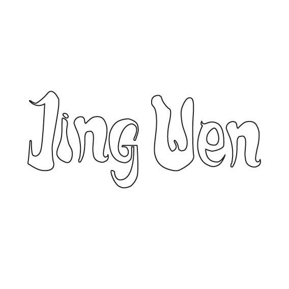 |
Figure 1.7 "Lost" -Animation
|
Figure 1.8 "Lost" - pdf file
On Monday (09/09/19), Mr Vinod updated the Facebook page with details of the next exercise - Type Expression.
Type Expression (Week 3 - Week 4)
Week 3 (11/09/19)
For this week, we have to do type expressions. The words given are CLEAN, GIGANTIC, PARTY, EXPLODE, EMERGE, SNEEZE. Mr Vinod also provided us some type families to use while expressing the words.
I sketched down my ideas on a piece of paper.
 |
| Figure 2.1 Type Expression - Draft |
After having it checked, I proceed to illustrating it. I made a few minor changes to my type expression and expressed "PARTY" in a different way.
 |
| Figure 2.2 Type Expression - Process |
For the animation, I chose to animate the type expression for "EXPLODE".
 |
| Figure 2.3 "Explode" - Screenshot of artboard for animation |
 |
| Figure 2.4 "Explode" - Still Image |
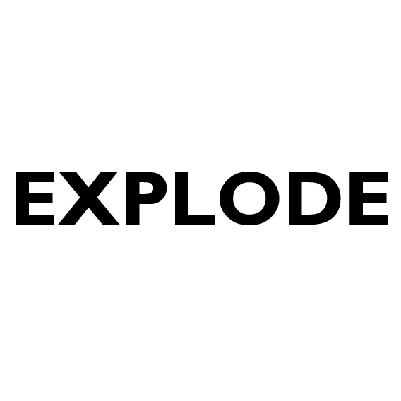 |
| Figure 2.5 "Explode" - Animation |
Figure 2.6 "Explode" - pdf
Week 4 (18/09/19)
After receiving feedback from Mr. Vinod and Mr Shamsul, I changed the design for "PARTY" again. I changed the typeface for the letter "Y" and also change the illustration of the umbrella by using the letters "A" and "T" to create the silhouette of the umbrella.
Week 4 (18/09/19)
After receiving feedback from Mr. Vinod and Mr Shamsul, I changed the design for "PARTY" again. I changed the typeface for the letter "Y" and also change the illustration of the umbrella by using the letters "A" and "T" to create the silhouette of the umbrella.
 |
| Figure 2.7 Final Outcome of Type Expression (JPEG) |
Figure 2.8 Final Outcome of Type Expression (PDF)
FEEDBACK
Week 2 (04/09/19)
After showing the drafts, both Mr Vinod and Mr Shamsul were quick to agree on one of the designs (which was the shadow design). However, they suggested that I should change the lettering but keep the idea. After I presented another lettering, they said that it was fine and that I should just continue on to the animating process.
Week 3 (11/09/19)
Specific Feedback :
(Animation)
Mr Vinod and Mr Shamsul said that the animation was okay. They mostly gave feedback on my blog saying that the pictures taken were neat and that I should add my characteristic in the caption of the photo. They also wanted me to add FINDINGS under reflections and update my blog with the animation and still image.
(Type expression)
For the words CLEAN and PARTY, Mr Vinod and Mr Shamsul think that I rely too much on illustration. They said that for CLEAN, I should try replacing the wiper with a gradient. They liked/was ok with GIGANTIC, EXPLODE and EMERGE. For SNEEZE, they suggested that the "NEEZE" can be placed below the nose. Overall they commented that I should try to make the alignments different instead of having it all in the center.
General Feedback :
Mr Vinod asked us to refer back to the reference he provided on Facebook.
Week 4 (18/09/19)
Specific Feedback :
Mr Vinod commented that the animation for explode was good. He liked that the letters were shaking before exploding and the smoke effect after "O" exploded.
General Feedback :
Mr Vinod wanted us to insert the actual photos in our blog instead of a screenshot. It should be in a PDF format. He also mentioned that we should record our whole process of making.
REFLECTION
Experience :
Week 1 (28/08/19); Before this I've never really touched typography. After trying to design myself while also looking at other people's design, I (genuinely) understand how important typography is. If the typography is good, the message can be conveyed and interpreted fluently. I feel like you wouldn't have to understand the language as long as the typography is design closely to what the message is trying to say. Hopefully I'll be able to learn more and improve. Week 2 (04/09/19); It was fun learning how to animate still drawings. When showing my letterings to Mr Vinod and Mr Shamsul, I actually thought that they would choose a different lettering. I guess this shows that different people really have different opinions. I was kind of bummed that they didn't choose the one that I was expecting but IT'S OKAY. I can work with it. :) Week 3 (11/09/19); I really liked importing the artboards into Photoshop and clicking every frame one by one. It's nice seeing all the artboards forming an animation! Week 4 (18/09/19); This week's experience was very different. We were told to move around the whole classroom to check out other people's work. My experience from this was that it was so cool how we just walked around looking at other people's artwork and thinking how they actually came up with their ideas.
Observation :
Week 1 (28/08/19); I notice how my classmates were struggling on what personality they should choose and how they should design it in order for it to send out the correct message. As for myself, I couldn't actually come out with 5 ideas that I'm totally happy with. However, I noticed that I should just try to draw something out (even if it doesn't seem relevant in the beginning) so that it gives me more inspiration and creates something else that is relevant. I think I should continue pushing myself to just do whatever I can and not be afraid that it might not turn out to be perfect because you never know what it'll lead you to. Week 2 (04/09/19); I notice how there were different students in the classroom. The students from foundation seem to know what they were doing, whereas students that didn't study art previously were taking down notes for every single thing the lecturers mentioned. Hopefully I can catch up with them! I also notice that it was quite hard to draw using the mouse pad so I'll definitely be using my mouse for further exercises. Week 3 (11/09/19); I saw that a lot of people used different ways to express the words given. A lot of them were very cool and it's very refreshing to see how everyone has different ideas. Week 4 (18/09/19); For this week, most of us were already done with animating and everything. Mr Vinod wanted us to walk around and see what everyone has done. I was quite amazed how a lot of people expressed GIGANTIC by highlighting "giant" in the word. I never noticed it before looking at other people's work. It was also interesting how there were a lot of different expressions done for "EXPLODE".
Findings :
Week 1 (28/08/19); I found that just drawing random things out is kind of useful. You never know what a random thought will lead you to. Also, I found that it's better if I update my blog as early as possible so I don't forget about it. Week 2 (04/09/19); I found that I usually think things to complex. I'm always worried that the final product isn't enough and add things that might not be necessary for the work. I feel like I really have to calm down and be a little bit more confident in keeping things more simple. Week 3 (11/09/19); I found that some words are actually easier to express than others. For me, I think adjectives are easier to express than nouns and verbs. I can think of possible animations and elements to include easily. I found it rather challenging to create a type expression for "PARTY". Week 4 (18/09/19); I found that walking around and looking at people's work is really cool and helpful. It makes me wonder how people think of their ideas and how much more I can improve.
FURTHER READING
A Typographic Workbook by Kate Clair and Cynthia Busic-Snyder
28/08/19 - 04/09/19 (Week 1 - Week 2)
 |
| Figure 3.2 A Typography Workbook |
There were a few types of writing systems back in the past. There was cuneiform, hieroglyphics, precursors, Sanskrit. These writing system help them record laws, history, scientific discoveries, medicine, mathematics, literature, philosophy, and religious practice. If it wasn't because of the writing system, we might not be able to learn so much about the past right now.
Pictograph-Based Writing System is basically using a simplified drawing to represent an object. This is assumed as the first step in developing most written language. For example, mandarin characters today are actually pictograph-based after thousand years of evolution.
What Is Typography? by David Jury
11/09/19 - 18/09/19 (Week 3 - Week 4)
 |
| Figure 3.1 WHAT IS TYPOGRAPHY? |
This book discusses about what typography is, the issues about it and also the anatomy of typography. The author also included a few portfolios of other typographers.
Based on the author, the arrangement of text on pages are taught at school from a very young age. This is because students are asked to leave the left margin clear so their teachers can leave comments. It also helps them keep their start of every line straight and aligned (which is actually flush left alignment). However, he feels that our education does not emphasis the importance of typography. Students are told to do so but they do not know why. This leads to them not understanding the importance of keeping their text readable and neat.
Besides that, he also commented about how the education system sees bad handwriting as a sign of "good" education. The education system only cares about the content and neglects the importance of the presentation of content. There are schools who teach typography, but they teach with a relaxed approach with no emphasis on craft and accuracy. They just tell the students what they're supposed to do/follow without telling them the reason behind it.
He also thinks that conventions are restraining our creativity. He does not deny the importance of conventions, but he feels that many people's creativity is questioned by conventions. He wants the new generation of typographers to understand that working within parameters should help make their typography good instead of restricting them from new ideas.
In the book, he also discussed about topics like grids, kerning, tracking, space between words and more. He records how we should use them to create better typography and the consequences of not managing them well.


Not enough reading material
ReplyDelete